Collection View
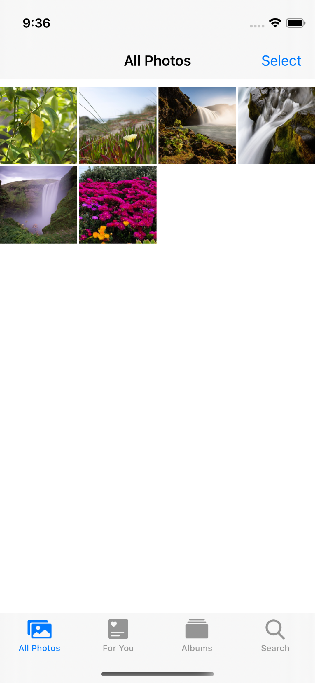
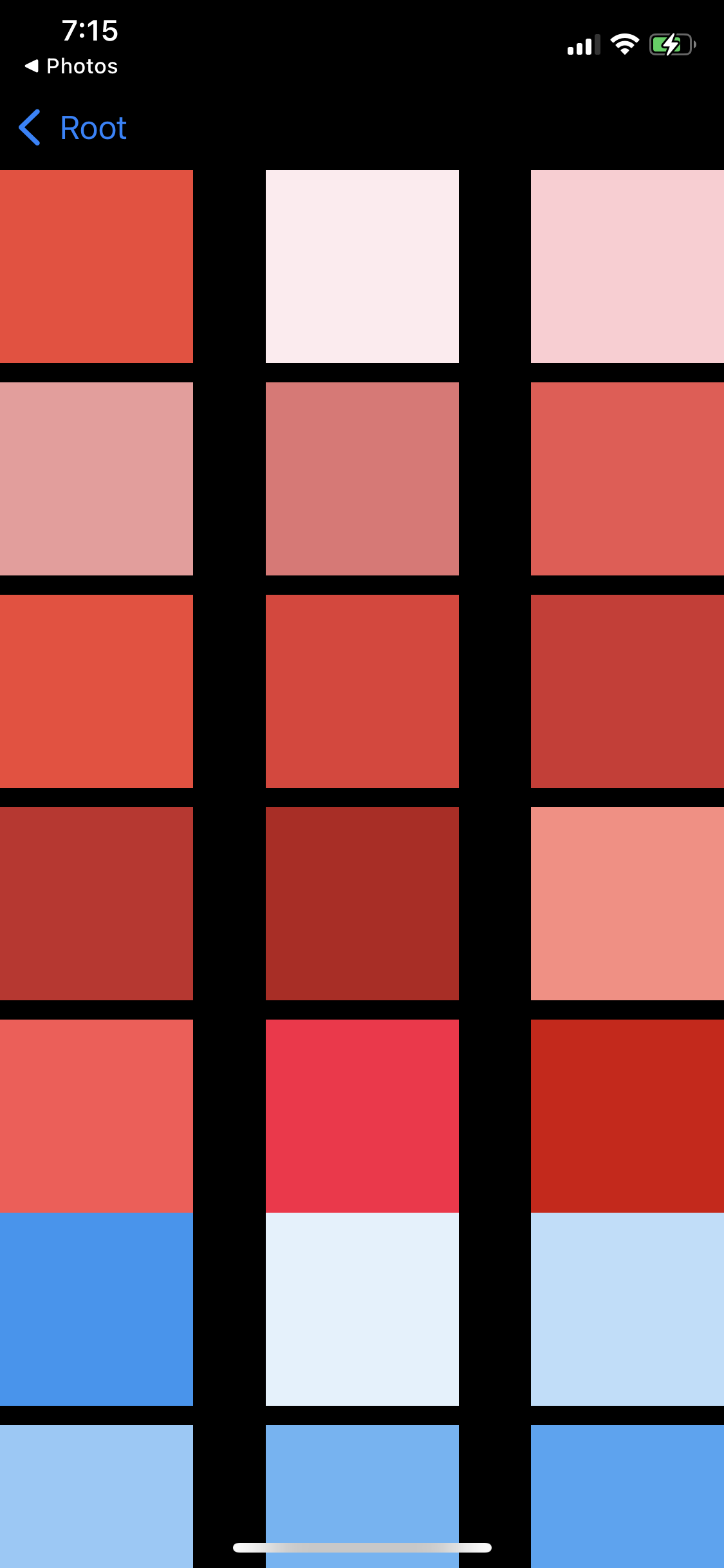
Collection View를 채용한 가장 좋은 예는 사진 앱이다.
Collection은 각각의 Cell로 컨텐츠를 표기하고,
Cell들을 묶어 제공할 수 있다. 각각의 그룹을 Section이라고 부른다.
Section을 구분하는 Header와 Footer가 존재하며, 이들은 Collection에서 Supplimentary View라고 부른다.
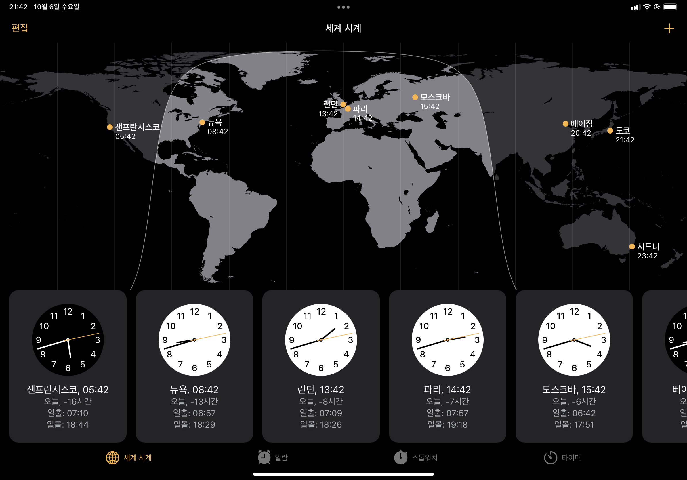
아이패드의 시계 앱도 Collection View를 사용한다.
Custom Layout을 통해 위와 같이 개성있는 UI를 구현할 수 있다.
Collection View의 배경으로 사용되는 View를 Decoration View라고 부르며, 위의 사진에서는 세계지도가 이에 해당한다.
Collection View는 Flow Layout을 제공한다.
이를 사용하면 수직이나 수평으로 스크롤 하는 UI를 쉽게 구현할 수 있다.
또한 Delegate 패턴을 사용해서 셀의 위치나 크기를 변경할 수 있다.
이를 사용할 때는 UICollectionViewLayout을 상속하고, 속성과 메소드를 overriding 하는 방식으로 구현한다.
Layout을 원하는 시점에 적용할 수 있고, 애니메이션의 적용도 간단하다.
- UICollectionViewDataSource
- UICollectionViewDelegate
의 클래스를 가지며, 구현 패턴은 Table View와 비슷하다.
표시할 데이터를 DataSource에서 요청하고, 이벤트의 처리는 Delegate에서 진행한다.
Collection View는 Table View와 비슷한 재사용 메커니즘을 사용한다.
Cell이 필요하거나 Suppliment View가 필요할 때 직접 생성하지 않고, Collection View에 요청한다.
Collection View는 prototype을 기반으로 View를 생성하거나 재사용큐의 View를 반환한다.
따라서 비교적 적은 자원으로 원하는 만큼 출력할 수 있다.
Collection View도 재사용 메커니즘을 사용하기때문에 스크롤 성능을 위해 두 가지의 Prefetching을 사용한다.
Cell Prefetching은 화면에 표시되는 Cell을 미리 준비해 두고, 스크롤할 때 발생할 수 있는 딜레이를 방지한다.
기본적으로 활성화 되며, 내부적으로도 자동으로 처리된다.
Data Prefetching은 Cell에 표시할 데이터를 미리 준비해 스크롤 성능을 높인다.
struct MaterialColorDataSource {
struct Section {
let title: String
var colors: [UIColor]
init(from color: MaterialColor.Type) {
self.title = color.title
self.colors = color.allColors
}
init() {
title = "Arbitrary Section"
colors = [UIColor.red, UIColor.green, UIColor.blue]
}
}
struct Color {
let title: String
let color: UIColor
let hex: String
init(from color: MaterialColor.Type) {
self.title = color.title
self.color = color.primary
self.hex = color.primary.rgbHexString
}
}
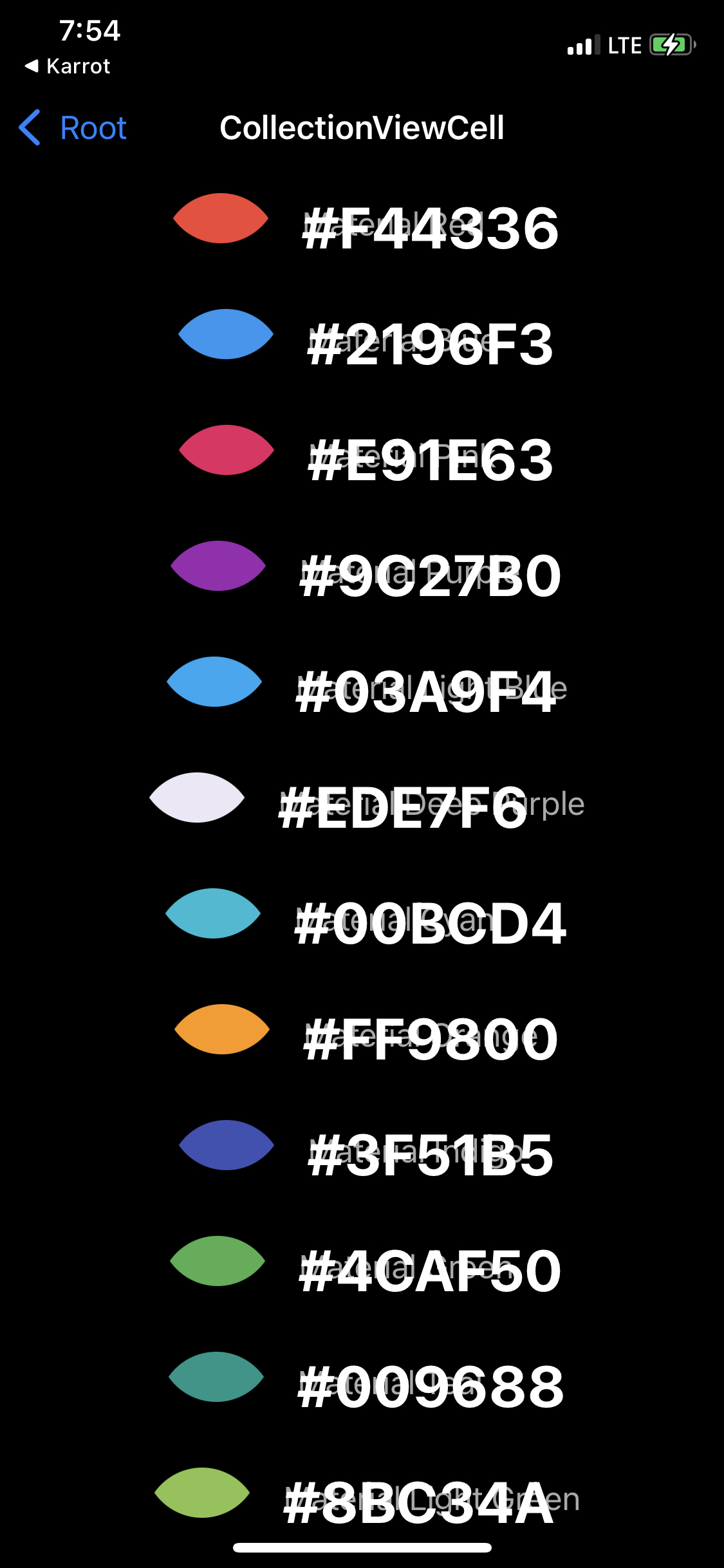
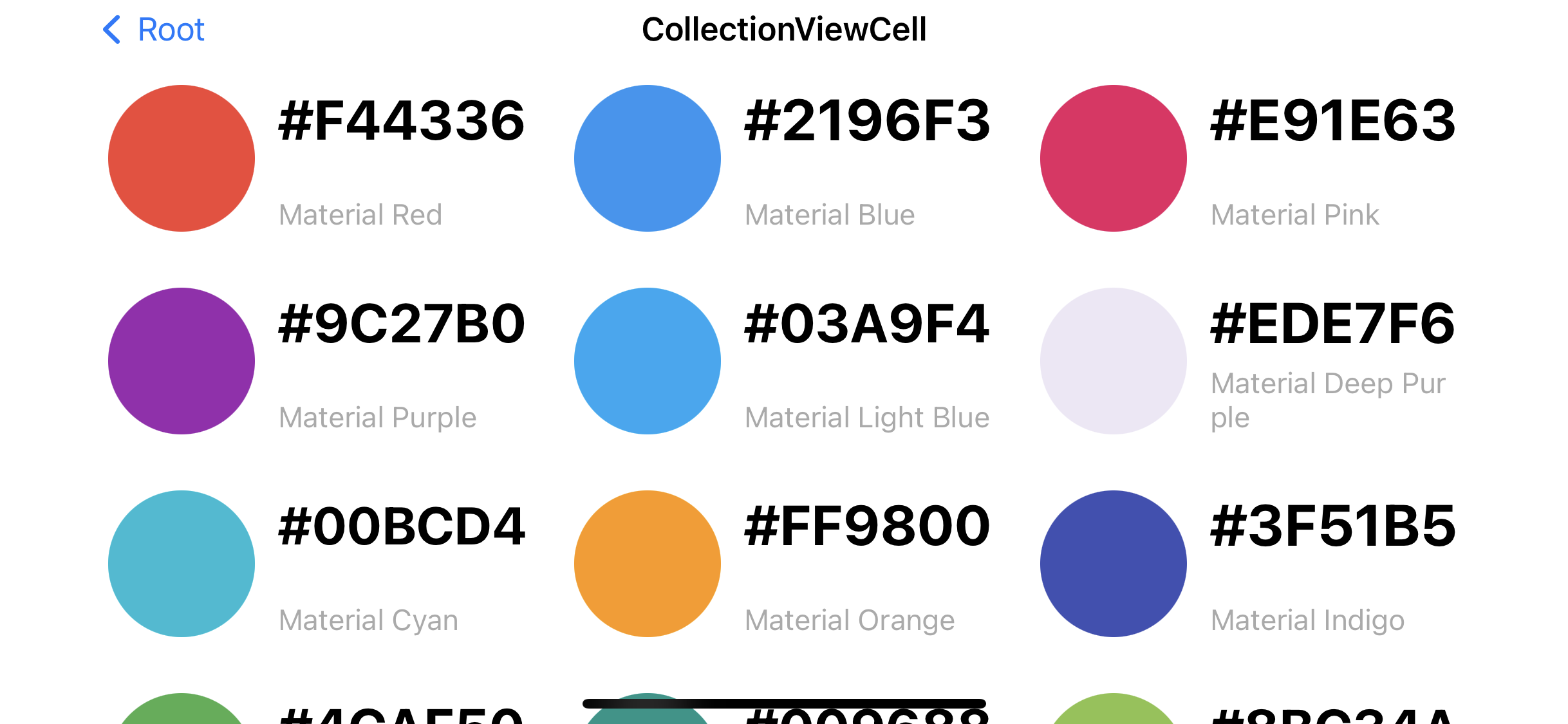
static let predefinedColor: [MaterialColor.Type] = [
UIColor.MaterialRed.self,
UIColor.MaterialBlue.self,
UIColor.MaterialPink.self,
UIColor.MaterialPurple.self,
UIColor.MaterialLightBlue.self,
UIColor.MaterialDeepPurple.self,
UIColor.MaterialCyan.self,
UIColor.MaterialOrange.self,
UIColor.MaterialIndigo.self,
UIColor.MaterialGreen.self,
UIColor.MaterialTeal.self,
UIColor.MaterialLightGreen.self,
UIColor.MaterialAmber.self,
UIColor.MaterialLime.self,
UIColor.MaterialDeepOrange.self,
UIColor.MaterialYellow.self,
]
static func generateSingleSectionData() -> [Color] {
return predefinedColor.map { Color(from: $0) }
}
static func generateMultiSectionData() -> [Section] {
return predefinedColor.map { Section(from: $0) }
}
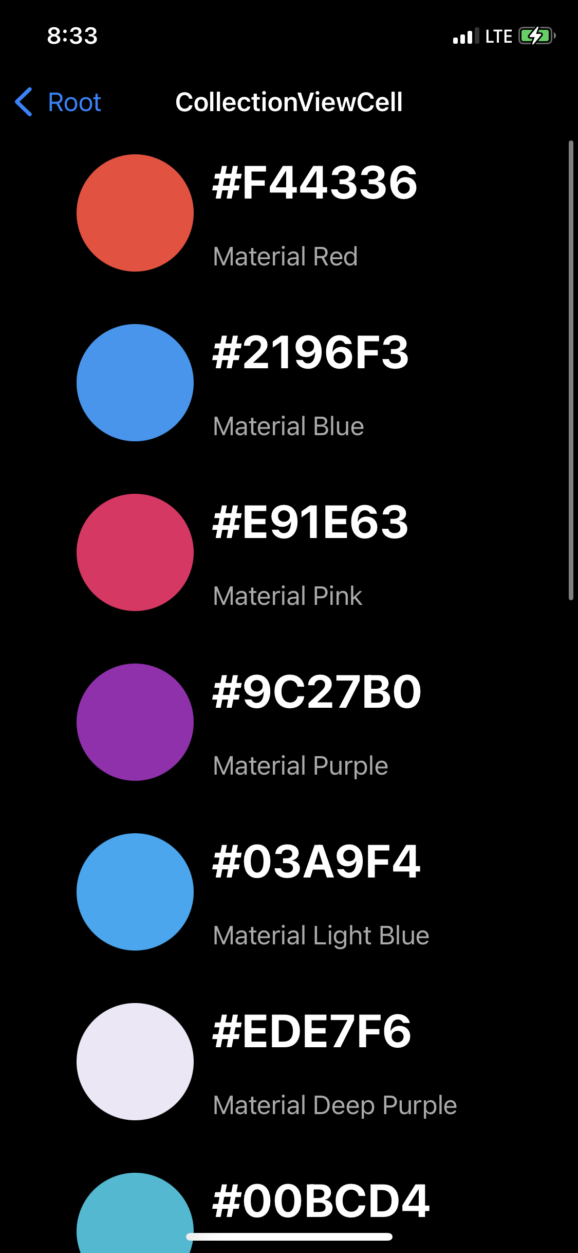
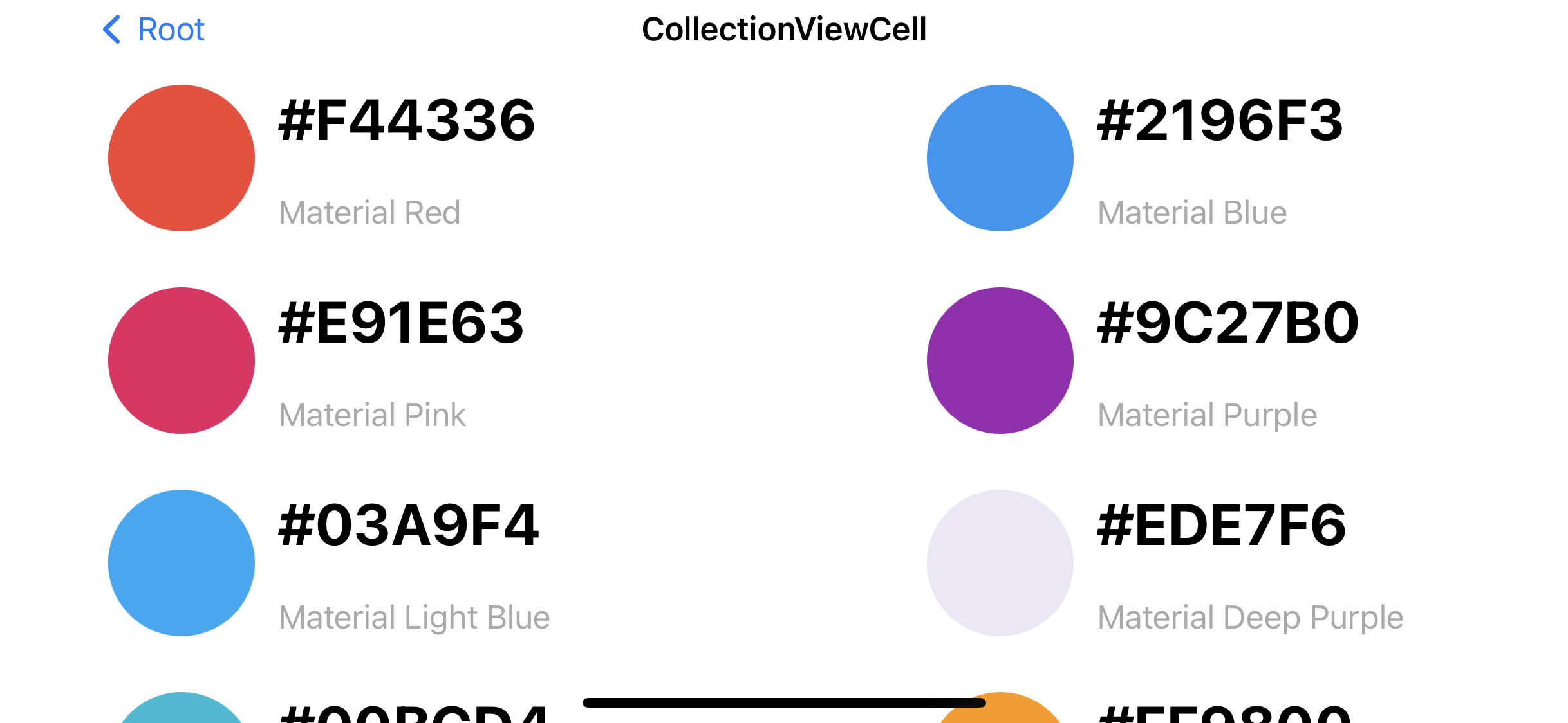
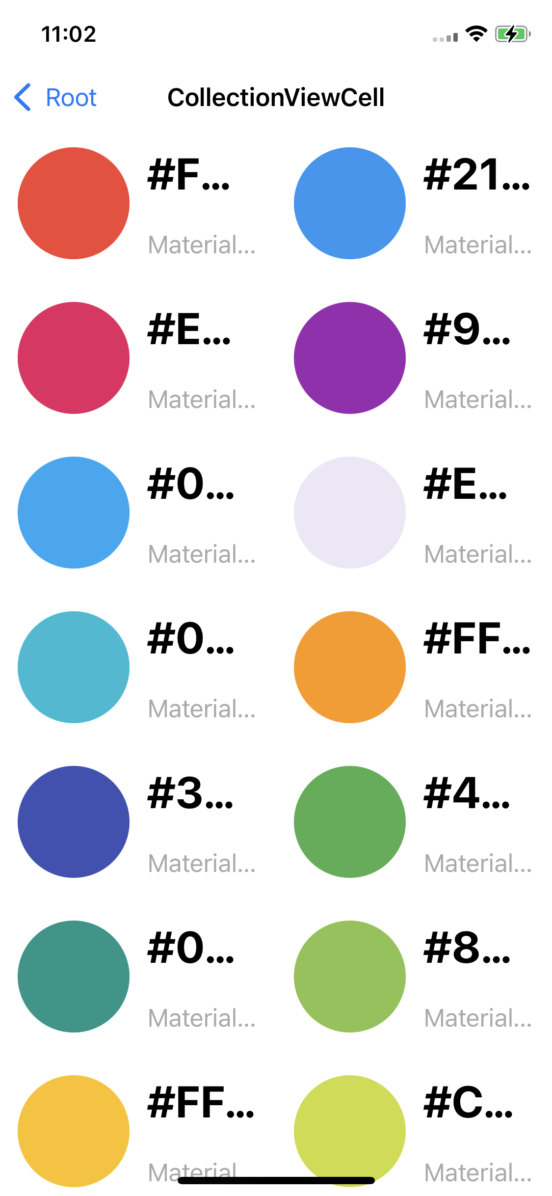
}예제의 코드에는 Collection View에 표시할 Color 데이터를 생성하는 코드가 구현돼 있다.
Section이나 Color 구조체로 반환되고,
임시 데이터는 generateSingleSectionData와 generateMultiSectionData 메소드로 구현되어있다.
//
// ColorListViewController.swift
// CollectionViewPractice
//
// Created by Martin.Q on 2021/10/06.
//
import UIKit
class ColorListViewController: UIViewController {
let list = MaterialColorDataSource.generateSingleSectionData()
override func viewDidLoad() {
super.viewDidLoad()
}
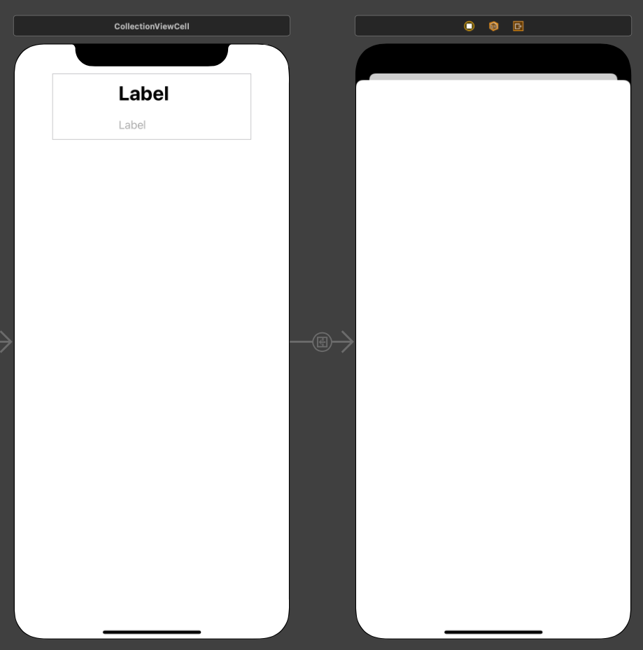
}사용할 씬과 코드는 위와 같다.
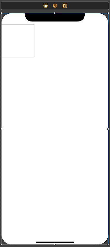
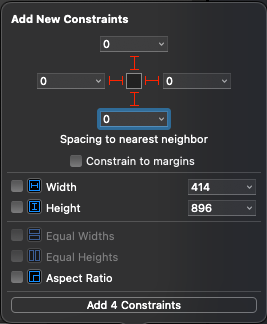
Collection VIew를 하나 추가하고, 화면 전체를 채우도록 제약을 추가한다.
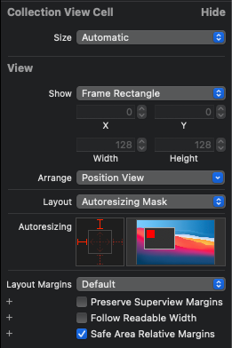
Cell의 Size Inspector의 Size 속성의 기본값은 Default가 아닌 Automatic으로 변경되었다.
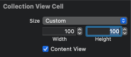
Custom으로 변경하고 원하는 사이즈로 바꾼다.
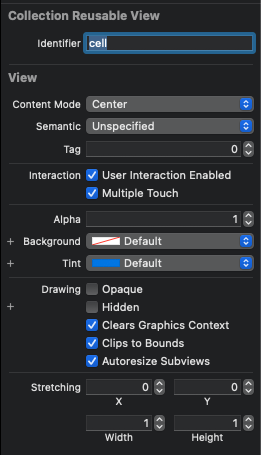
이후 Attribute Inspector에서 Identifier를 지정한다.
Collection View는 재사용 메커니즘을 사용하기 때문에 Collection View에 Cell을 요청해야 한다.
지금 지정한 Identifier는 Cell을 요청할 때 사용된다.
Collection View의 Cell은 기본 스타일을 제공하지 않는다.
따라서 CellUI를 구성하고, CustomClass를 생성한 후 outlet을 연결해야 한다.
지금은 단순히 생성된 데이터를 Cell의 Background Color로 지정한다.
//
//  ColorListViewController.swift
//  CollectionViewPractice
//
//  Created by Martin.Q on 2021/10/06.
//

import UIKit

class ColorListViewController: UIViewController {

	let list = MaterialColorDataSource.generateSingleSectionData()

	override func viewDidLoad() {
		super.viewDidLoad()
	}

}

extension ColorListViewController: UICollectionViewDataSource {
	func collectionView(_ collectionView: UICollectionView, numberOfItemsInSection section: Int) -> Int {

	}

	func collectionView(_ collectionView: UICollectionView, cellForItemAt indexPath: IndexPath) -> UICollectionViewCell {

	}


}
Collection View의 DataSource로 신을 연결하고,
코드에서는 extension을 통해 UICollectionViewDataSource를 채용해 필수 메소드를 구현한다.
extension ColorListViewController: UICollectionViewDataSource {
	func collectionView(_ collectionView: UICollectionView, numberOfItemsInSection section: Int) -> Int {
		return list.count
	}

	func collectionView(_ collectionView: UICollectionView, cellForItemAt indexPath: IndexPath) -> UICollectionViewCell {
		let cell = collectionView.dequeueReusableCell(withReuseIdentifier: "cell", for: indexPath)
		cell.contentView.backgroundColor = list[indexPath.item].color
		return cell
	}
}
Collectionview(numberOfItemsInSection:)메소드로 표시할 셀의 수를 반환하고,
Collectionview(cellForItemAt:)메소드로 Cell을 구성해 반환한다.
TableView에선 Section과 Row로 IndexPath가 구성됐지만,
Collection View에선 Section과 Item으로 IndexPath가 구성되고,
메소드의 이름이 다르다는 것만 제외하면 구현 방식은 동일하다.
실행해 보면 Cell의 사이즈를 조정했지만 원하는 만큼 커지지 않았다.
조절한 것은 Prototype Cell의 크기이지, Cell 안의 Content View는 따로 설정해야 한다.
class ColorListViewController: UIViewController {

	let list = MaterialColorDataSource.generateMultiSectionData()

	override func viewDidLoad() {
		super.viewDidLoad()
	}

}
이번엔 멀티 섹션을 구현하기 위해 생성 데이터를 generateMultiSectionData로 변경했다.
Section 구조체를 반환하게 되고, Section 구조체 안에는 Colors 속성이 존재하고,
해당 속성엔 Section에 속하는 color가 저장되어있다.
extension ColorListViewController: UICollectionViewDataSource {
	func numberOfSections(in collectionView: UICollectionView) -> Int {
		return list.count
	}
	func collectionView(_ collectionView: UICollectionView, numberOfItemsInSection section: Int) -> Int {
		return list[section].colors.count
	}
	func collectionView(_ collectionView: UICollectionView, cellForItemAt indexPath: IndexPath) -> UICollectionViewCell {
		let cell = collectionView.dequeueReusableCell(withReuseIdentifier: "cell", for: indexPath)
		cell.contentView.backgroundColor = list[indexPath.section].colors[indexPath.item]
		return cell
	}
}
변경된 데이터에 맞게 코드를 추가, 수정한다.
numberOfSections 메소드는 Section의 수를 반한하게 되고, 이번엔 list 배열 안의 데이터의 수를 반환한다.
Collectionview(cellForItemAt:)메소드도 수정되는데, section과 item으로 해당하는 데이터를 지정해 줘야 한다.
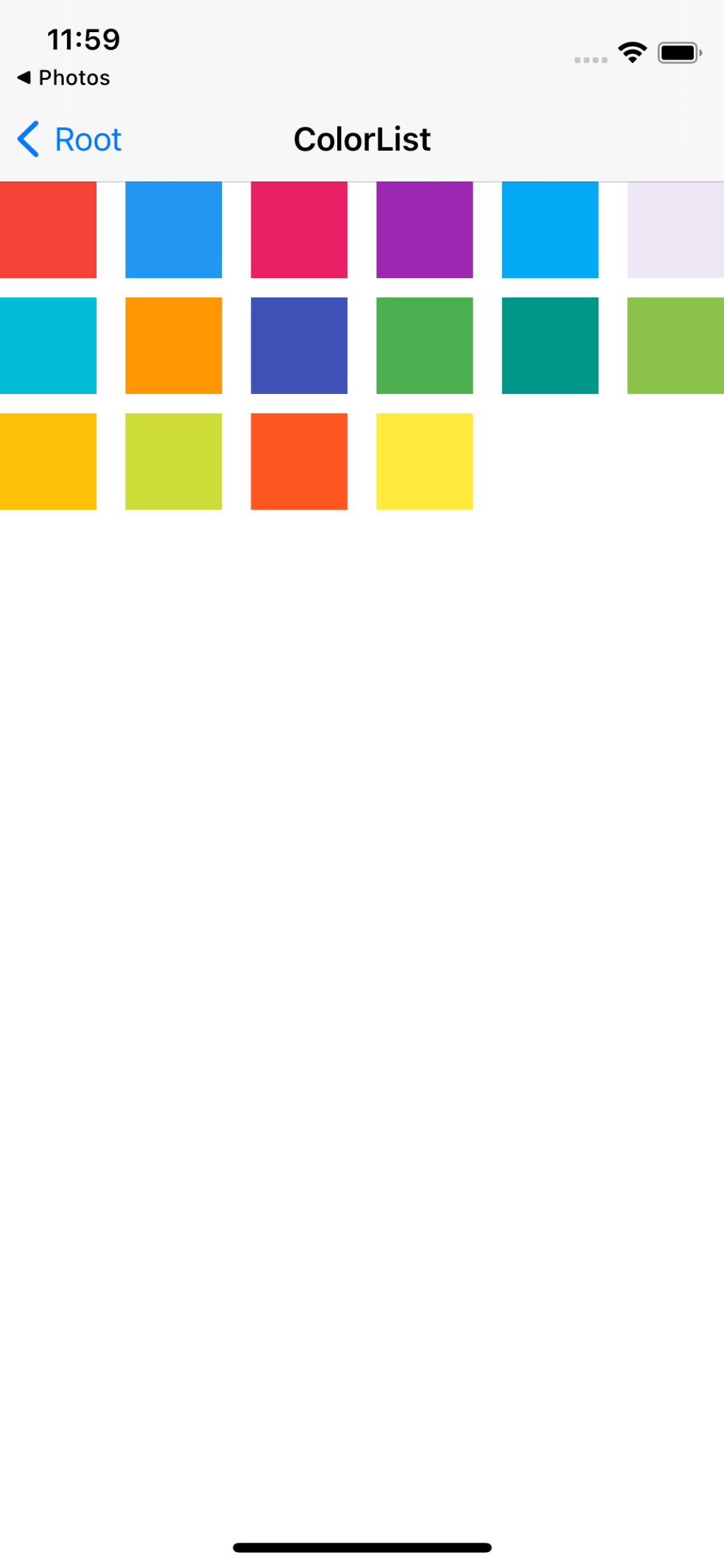
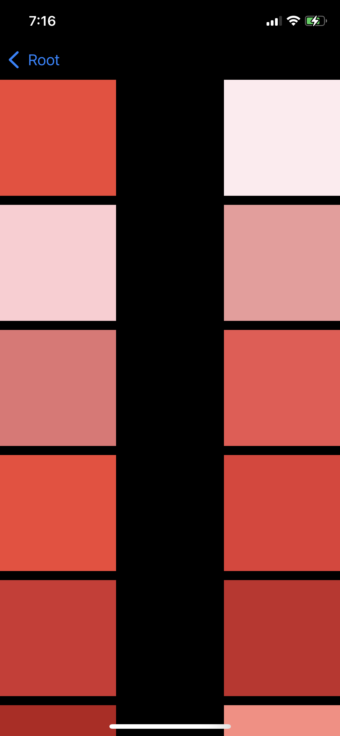
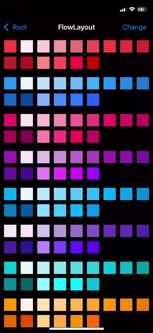
여러 개의 Section이 존재하고, Section마다 별개의 색상들이 출력됐다.
지금은 Cell의 크기가 고정되어 있고 Cell 간의 간격과 Section 간의 간격도 고정되어 있다.
해당 속성들은 Layout 객체를 통해 수정할 수 있다.
또한 Collection View의 기본 스크롤 방향은 수직이다.
Collection View가 기본으로 제공하는 Flow Layout은 수직과 수평 모두를 지원한다.
마찬가지로 Layout 객체의 수정을 통해 변경할 수 있다.
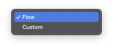
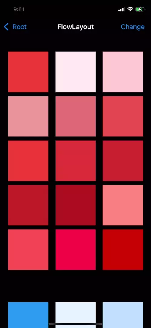
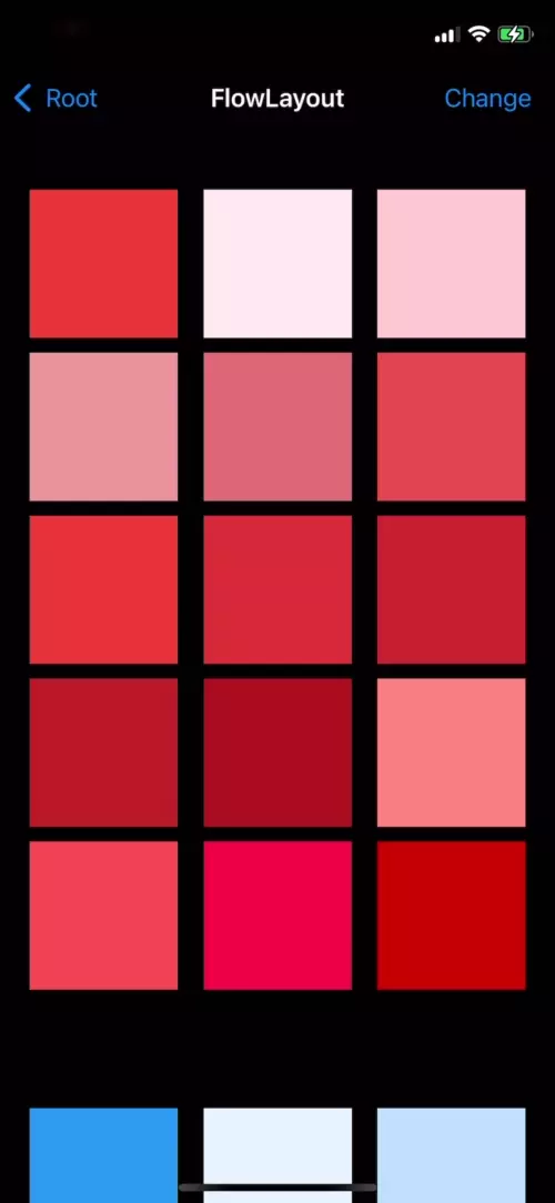
Flow Layout
Collection View는 기본적으로 Flow Layout을 통해 뷰를 배치한다.
하지만 직접 Layout 객체를 생성하고 Flow Layout 대신에 사용할 수도 있다.
Collection View는 언제든 Layout을 전환할 수 있고, 전환 간 애니메이션을 쉽게 적용할 수도 있다.
UICollectionViewFlowLayout 클래스로 구현되어 있으며,
기본적으로 모든 Layout 대상에 공통으로 적용되나,
Delegate 패턴을 사용하여 대상마다 다르게 적용할 수도 있다.
- 수직
셀을 수평으로 배치한다.
지정된 크기와 여백으로 배치하다가 공간이 없다면 아래쪽으로 이동해 이어서 배치한다. - 수평
셀을 수직 방향으로 배치한다.
지정된 크기와 여백으로 배치하다가 공간이 없다면 오른쪽으로 이동해 이어서 배치한다.
Flow Layout은 셀을 수평, 수직 중 지정된 방향으로 1열로 배치한다.
배치 순서는 스크롤 방향에 따라 달라진다.
- itemSize
셀 크기는 itemSize 속성으로 설정할 수 있으며, 128 * 128이 기본 값이다. - minimumInteritemSpacing
셀 사이 여백은 고정된 값이 아닌 최솟값으로 설정한다.
한 줄에 표시되는 셀의 너비와 셀 사이의 여백을 더한 값이 Collection View의 너비와 같다면 문제가 없다. - minimumLineSpacing
줄 사이 여백은 고정된 값이 아닌 최솟값으로 설정한다.
한 줄에 속한 모든 셀의 높이가 일정하고, 이어지는 줄에 속한 셀의 높이도 동일하다면 줄 여백이 일정하다.
minimumInteritemSpacing과 minimimLineSpacing은 셀의 크기가 달라져 간격이 일정하지 않아도, 최소 여백을 보정한다.
기본값은 10pt로, 스크롤 방향에 따라 그 기준이 달라진다.
- 가로
Interitem Spacing : 좌우의 셀 사이의 간격
Line Spacing : 상하의 셀 사이의 간격 - 세로
Interitem Spacing : 상하의 셀 사이의 간격
Line Spacing : 좌우의 셀 사이의 간격
sectionInset
Section의 상하좌우 여백으로, 각각 개별로 설정할 수 있다.
또한 Interitem Space와 Line Space와 달리 고정된 값을 사용한다.
기본값은 0이다.
//
//  FlowLayoutViewController.swift
//  CollectionViewPractice
//
//  Created by Martin.Q on 2021/10/07.
//

import UIKit

class FlowLayoutViewController: UIViewController {

	let list = MaterialColorDataSource.generateMultiSectionData()

	override func viewDidLoad() {
		super.viewDidLoad()

	}
}

extension FlowLayoutViewController: UICollectionViewDataSource {
	func numberOfSections(in collectionView: UICollectionView) -> Int {
		return list.count
	}
	func collectionView(_ collectionView: UICollectionView, numberOfItemsInSection section: Int) -> Int {
		return list[section].colors.count
	}

	func collectionView(_ collectionView: UICollectionView, cellForItemAt indexPath: IndexPath) -> UICollectionViewCell {
		let cell = collectionView.dequeueReusableCell(withReuseIdentifier: "cell", for: indexPath)
		cell.contentView.backgroundColor = list[indexPath.section].colors[indexPath.item]
		return cell
	}
}
사용할 씬과 코드는 위와 같다.

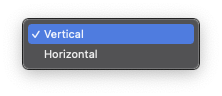
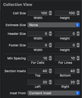
Flow Layout을 사용하기 위해선 Attribute Inspector에서 Layout 속성이 Flow로 설정되어있어야 한다.
바로 아래의 Scroll Direction은 스크롤 방향을 선택한다.
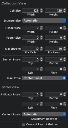
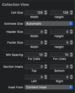
Size Inspector에서 셀과 섹셕읜 크기와 inset을 설정할 수 있다.
Cell Size는 100 * 100으로 변경한다.
MinSpacing에서는 셀과 줄의 여백을 설정할 수 있다. 기본값인 10을 그대로 사용한다.
Section Insets은 섹션의 여백을 설정한다.
이때 Estimate Size를 None으로 변경해 보정을 풀어 변화를 확인할 수 있도록 한다.
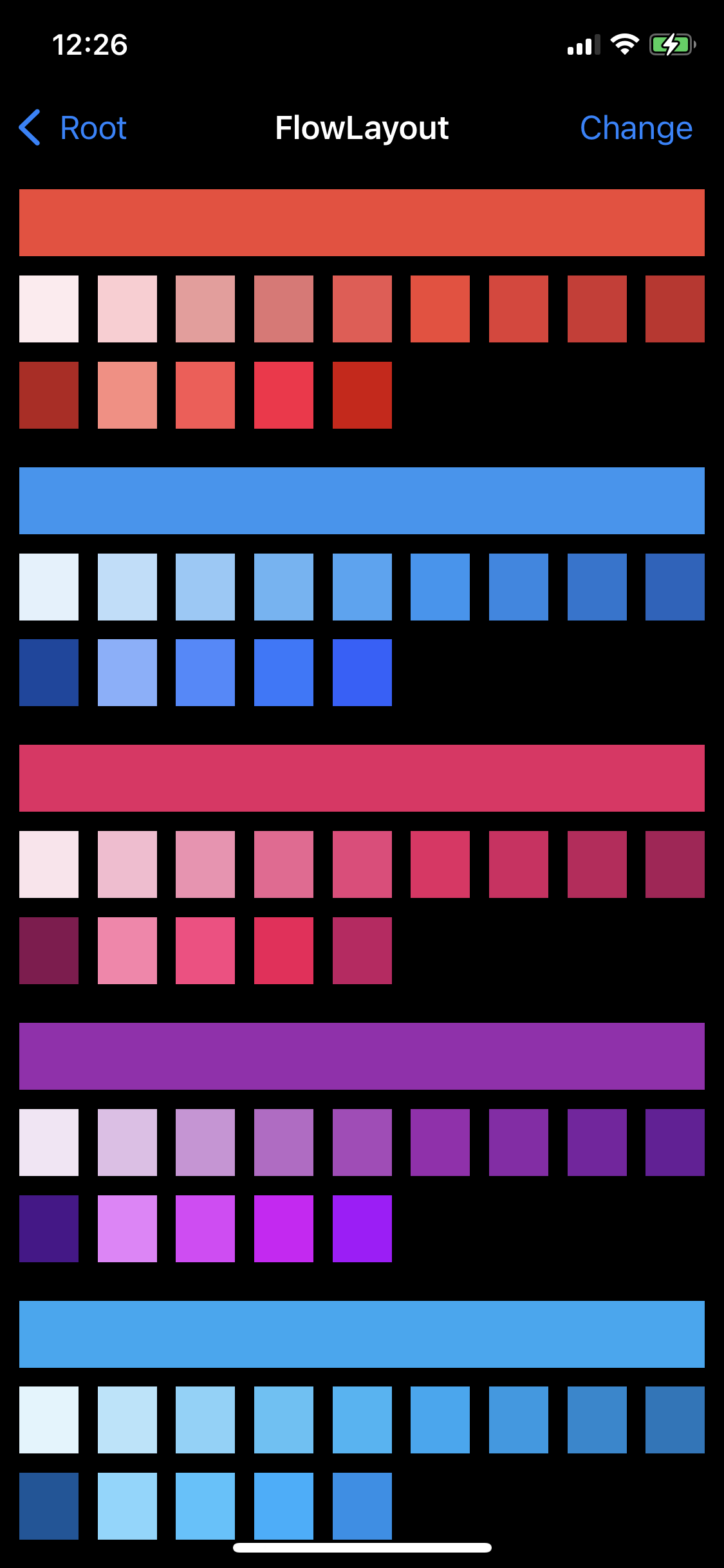
기본 상태인 128과 100의 차이이다.
셀 여백과 줄 간격은 고정값이 아닌 최솟값이기 때문에, 배치와 크기에 따라 유동적으로 변한다.
수직 스크롤인 지금 상황에선 줄 간격이 일정하고, 셀 여백이 변하긴 하지만 일정하게 나열된 것을 볼 수 있다.
지금은 섹션 여백이 0으로 설정되어있어 빨간색과 파란색의 섹션 경계가 구분 없이 딱 붙어 있는 것을 볼 수 있다.
셀 여백과 줄 간격은 셀 간의 여백을 의미하지, 셀과 섹션 간에는 적용이 되지 않아
가장 첫 번째 셀의 상단과 좌측은 여백이 적용되지 않는 것을 볼 수 있다.
이번엔 Section Inset을
상단 40, 하단 40, 좌측 20, 우측 20
으로 설정했다.

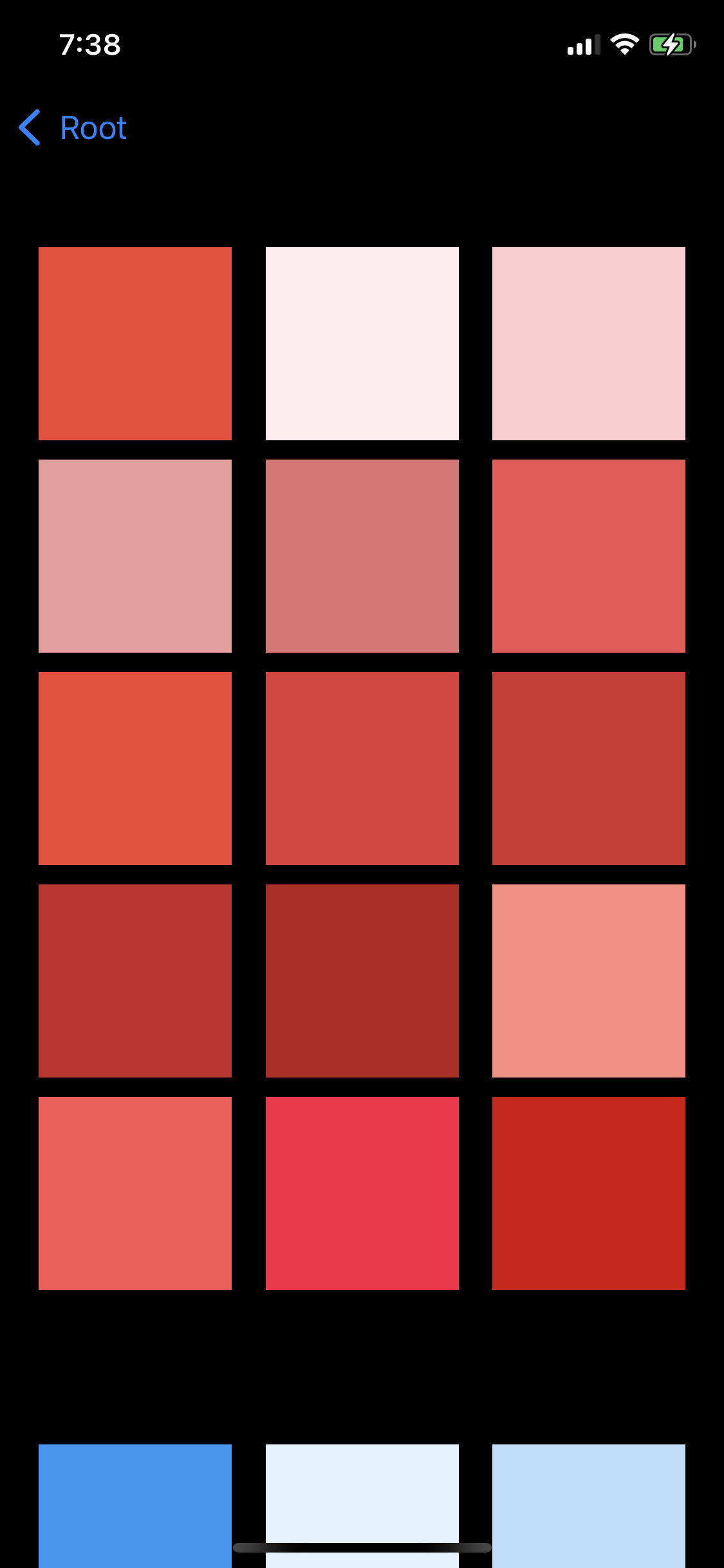
이전과 다르게 셀들이 화면의 테두리에 붙어있지 않고,
적당항 간격으로 떨어져 있는 것을 볼 수 있다.
또한 섹션과 섹션 사이의 간격도 정확히 구분될 만큼 떨어져 있다.
이번엔 코드로 수정해 본다.
class FlowLayoutViewController: UIViewController {
	@IBOutlet weak var collectionView: UICollectionView!


	let list = MaterialColorDataSource.generateMultiSectionData()

	override func viewDidLoad() {
		super.viewDidLoad()
	}
}
CollectionView를 수정하기 위해 outlet으로 연결한다.
class FlowLayoutViewController: UIViewController {
	@IBOutlet weak var collectionView: UICollectionView!


	let list = MaterialColorDataSource.generateMultiSectionData()

	@objc func changeDirection () {
		guard let layout = collectionView.collectionViewLayout as? UICollectionViewFlowLayout else { return }

		layout.scrollDirection = layout.scrollDirection == .vertical ? .horizontal : .vertical
	}

	override func viewDidLoad() {
		super.viewDidLoad()
	}
}
이후 collectionViewLayout 속성을 수정할 수 있도록 메소드를 작성한다.
collectionViewLayout 속성은 UICollectionViewLayout 클래스 형식이다.
Layout 객체는 해당 클래스로 업 캐스팅되어 저장된다.
따라서 속성을 변경할 때는 실제 Layout 객체로 타입 캐스팅 해야 한다.
따라서 guard문을 사용해 타입캐스팅 후 바인딩한다.
class FlowLayoutViewController: UIViewController {
	@IBOutlet weak var collectionView: UICollectionView!


	let list = MaterialColorDataSource.generateMultiSectionData()

	@objc func changeDirection () {
		guard let layout = collectionView.collectionViewLayout as? UICollectionViewFlowLayout else { return }

		layout.scrollDirection = layout.scrollDirection == .vertical ? .horizontal : .vertical
	}

	override func viewDidLoad() {
		super.viewDidLoad()

		navigationItem.rightBarButtonItem = UIBarButtonItem(title: "Change", style: .plain, target: self, action: #selector(changeDirection))

	}
}
이후 내비게이션 바에 버튼을 추가하고, 해당 메소드를 연결한다.
정상적으로 스크롤 방향이 변경되면서 정렬 방식도 바뀌는 것을 볼 수 있다.
이번엔 조금 더 자연스러운 전환을 위해 애니메이션을 적용해 본다.
collectionView.performBatchUpdates(updates: (() -> Void)?, completion: ((Bool) -> Void)?)Collection View가 제공하는 performBatchUpdate 메소드는
updates에 블록으로 전달된 코드를 실행하고 애니메이션을 적용한다.
completion은 updates 이후 실행할 코드를 전달한다.
@objc func changeDirection () {
	guard let layout = collectionView.collectionViewLayout as? UICollectionViewFlowLayout else { return }

	collectionView.performBatchUpdates ({
		layout.scrollDirection = layout.scrollDirection == .vertical ? .horizontal : .vertical
	}, completion: nil)

}
따라서 코드를 위와 같이 수정한다.
의도한 대로 적용된 것을 볼 수 있다.
Flow Layout은 이러한 방식으로 애니메이션을 적용한다.
override func viewDidLoad() {
	super.viewDidLoad()

	navigationItem.rightBarButtonItem = UIBarButtonItem(title: "Change", style: .plain, target: self, action: #selector(changeDirection))

	if let layout = collectionView.collectionViewLayout as? UICollectionViewFlowLayout {
		layout.itemSize = CGSize(width: 30, height: 30)
		layout.minimumInteritemSpacing = 10
		layout.minimumLineSpacing = 10

		layout.sectionInset = UIEdgeInsets(top: 10, left: 10, bottom: 10, right: 10)
	}

}
이후 viewDidLoad에서 셀 크기, 셀 여백, 줄 간격, 섹션 여백을 설정한다.
여느 인터페이스 들과 마찬가지로 코드가 interface builder보다 더 높은 우선순위를 가진다.
셀 여백과 줄 간격은 스크롤 방향에 따라 변경되지만, 섹션의 여백은 항상 동일한 것을 확인할 수 있다.
Layout을 개별로 설정하거나 동적으로 설정하고 싶다면 Delegate 패턴을 사용한다.
Delegate 패턴을 사용해 첫 번째 셀은 한 줄을 꽉 채우도록 수정한다.
extension FlowLayoutViewController: UICollectionViewDelegateFlowLayout {
	func collectionView(_ collectionView: UICollectionView, layout collectionViewLayout: UICollectionViewLayout, sizeForItemAt indexPath: IndexPath) -> CGSize {

	}
}
extension을 사용해 UICollectionViewDelegateFlowLayout을 채용하고,
collectionView(sizeForItemAt:)메소드 호출한다.
이 메소드는 Collection View가 셀을 배치하기 직전에 호출해 크기를 설정하기 위해 호출한다.
이 메소드에서 반환하는 크기는 앞서 설정했던 크기보다 우선순위가 높다.
두 번째 파라미터를 통해 전달된 Layout 객체로 현재 설정된 설정을 확인 할 수 있다.
또, 마지막 파라미터인 indexPath를 통해 셀의 위치를 판단할 수 있다.
guard let layout = collectionViewLayout as? UICollectionViewFlowLayout else {
	return CGSize.zero
}
우선 전달 된 collectionViewLayout을 UICollectionViewFlowLayout으로 타입 캐스팅한다.
Collection View는 씬 전체를 채우고 있고,
Navigation Bar와 겹치지 않도록 자동으로 상단 여백을 추가한다.
따라서 첫 번째 줄에 출력되는 셀을 해당 여백만큼 아래로 내려와 출력된다.
따라서 셀의 높이를 계산하려면 추가된 높이를 고려해 계산해야 한다.
func collectionView(_ collectionView: UICollectionView, layout collectionViewLayout: UICollectionViewLayout, sizeForItemAt indexPath: IndexPath) -> CGSize {
	guard let layout = collectionViewLayout as? UICollectionViewFlowLayout else {
		return CGSize.zero
	}

	var bound = collectionView.bounds
	bound.size.height += bound.origin.y
}
Collection View의 크기를 이용해 높이를 계산에 필요한 높이로 수정한다.
func collectionView(_ collectionView: UICollectionView, layout collectionViewLayout: UICollectionViewLayout, sizeForItemAt indexPath: IndexPath) -> CGSize {
	guard let layout = collectionViewLayout as? UICollectionViewFlowLayout else {
		return CGSize.zero
	}

	var bound = collectionView.bounds
	bound.size.height += bound.origin.y

	var width = bound.width - (layout.sectionInset.left + layout.sectionInset.right)
	var height = bound.height - (layout.sectionInset.top + layout.sectionInset.bottom)
}
이것과 더불에 Section Inset도 고려해야 한다.
Collection View의 크기에서 Section Inset을 빼면 Cell을 대체할 수 있는 최대 크기를 얻을 수 있다.
최대 높이와 너비를 계산해 변수에 저장한다.
extension FlowLayoutViewController: UICollectionViewDelegateFlowLayout {
	func collectionView(_ collectionView: UICollectionView, layout collectionViewLayout: UICollectionViewLayout, sizeForItemAt indexPath: IndexPath) -> CGSize {
		guard let layout = collectionViewLayout as? UICollectionViewFlowLayout else {
			return CGSize.zero
		}

		var bound = collectionView.bounds
		bound.size.height += bound.origin.y

		var width = bound.width - (layout.sectionInset.left + layout.sectionInset.right)
		var height = bound.height - (layout.sectionInset.top + layout.sectionInset.bottom)

		switch layout.scrollDirection {
		case .vertical:
			height = (height - (layout.minimumLineSpacing * 15)) / 16
			if indexPath.item > 0 {
				width = (width - (layout.minimumLineSpacing * 8)) / 9
			}
		case .horizontal:
			width = (width - (layout.minimumLineSpacing * 8)) / 9
			if indexPath.item > 0 {
				height = (height - (layout.minimumLineSpacing * 15)) / 16
			}
		default:
			break
		}
		return CGSize(width: width, height: height)
	}
}
이후 스크롤 방향에 따라 최종 높이와 너비를 계산한다.
계산할 때는 Line Space와 Interitem Space를 고려해 적절히 계산해야 한다.
이후 계산된 크기를 반환한다.
func collectionView(_ collectionView: UICollectionView, layout collectionViewLayout: UICollectionViewLayout, minimumInteritemSpacingForSectionAt section: Int) -> CGFloat {
	return 10
}
func collectionView(_ collectionView: UICollectionView, layout collectionViewLayout: UICollectionViewLayout, minimumLineSpacingForSectionAt section: Int) -> CGFloat {
	return 10
}
이후 DataSource에 위의 메소드를 추가한다.
collectionView(minimumInteritemSpacingForSectionAt:)와
collectionView(minimumLineSpacingForSectionAt:)메소드는 셀 간격이 필요할 때마다 호출된다.
func collectionView(_ collectionView: UICollectionView, layout collectionViewLayout: UICollectionViewLayout, insetForSectionAt section: Int) -> UIEdgeInsets {
	return UIEdgeInsets(top: 10, left: 10, bottom: 10, right: 10)
}
collectionView(insetForSectionAt:)메소드는 Section Inset이 필요할 때 호출된다.
extension FlowLayoutViewController: UICollectionViewDelegateFlowLayout {
	func collectionView(_ collectionView: UICollectionView, layout collectionViewLayout: UICollectionViewLayout, sizeForItemAt indexPath: IndexPath) -> CGSize {
		print(indexPath.section, "#1", #function)
		guard let layout = collectionViewLayout as? UICollectionViewFlowLayout else {
			return CGSize.zero
		}

		var bound = collectionView.bounds
		bound.size.height += bound.origin.y

		var width = bound.width - (layout.sectionInset.left + layout.sectionInset.right)
		var height = bound.height - (layout.sectionInset.top + layout.sectionInset.bottom)

		switch layout.scrollDirection {
		case .vertical:
			height = (height - (layout.minimumLineSpacing * 15)) / 16
			if indexPath.item > 0 {
				width = (width - (layout.minimumInteritemSpacing * 8)) / 9
			}
		case .horizontal:
			width = (width - (layout.minimumLineSpacing * 8)) / 9
			if indexPath.item > 0 {
				height = (height - (layout.minimumInteritemSpacing * 15)) / 16
			}
		default:
			break
		}
		return CGSize(width: width, height: height)
	}
	func collectionView(_ collectionView: UICollectionView, layout collectionViewLayout: UICollectionViewLayout, minimumInteritemSpacingForSectionAt section: Int) -> CGFloat {
		print(section, "#2", #function)
		return 10
	}
	func collectionView(_ collectionView: UICollectionView, layout collectionViewLayout: UICollectionViewLayout, minimumLineSpacingForSectionAt section: Int) -> CGFloat {
		print(section, "#3", #function)
		return 10
	}
	func collectionView(_ collectionView: UICollectionView, layout collectionViewLayout: UICollectionViewLayout, insetForSectionAt section: Int) -> UIEdgeInsets {
		print(section, "#4", #function)
		return UIEdgeInsets(top: 10, left: 10, bottom: 10, right: 10)
	}
}
이후 메소드마다 로그를 출력하도록 코드를 추가하고 결과를 확인한다.
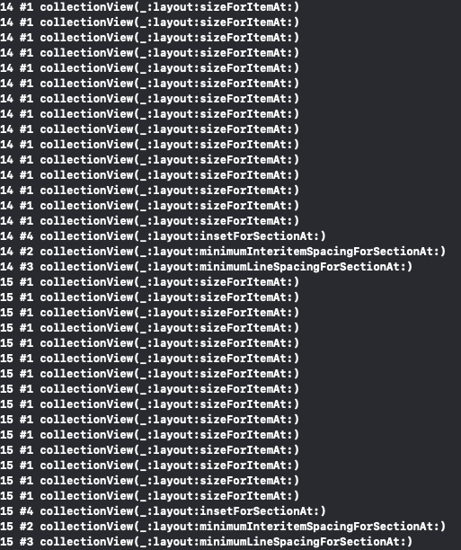
원하는 결과와 비슷한 듯 하지만 셀의 크기가 오묘하다.
로그를 확인해 보면 셀의 크기를 계산하는 1번 메소드가 셀의 수만큼 호출되고.
이어서 Section Inset, InteritemSpace, LineSpace가 호출된다.
코드를 확인해 보면 셀의 크기를 계산하는 시점은 아래의 다른 Inset과 여백이 계산되기 전이다.
또한, 메소드에서 반환하는 사이즈들은 우선순위가 높은 것은 맞지만, Layout 속성의 값을 대체하지는 않는다.
따라서 셀 크기의 계산에 사용하는 값들은 메소드에서 반환하는 값이 아닌 ViewDidLoad에서 설정하는 값들을 사용한다.
문제를 해결하는 방법은 두 가지이다.
- 셀 크기를 계산할 때 Layout 속성을 참고하는 것이 아닌 메소드에서 반환하는 값을 사용하는 방법.
let itemSpace = self.collectionView(collectionView, layout: collectionViewLayout, minimumInteritemSpacingForSectionAt: indexPath.section)위와 같이 메소드가 반환하는 값을 불러 올 수 있다.
- 메소드가 호출되기 전에 계산에 필요한 값을 원하는 값으로 대체하는 방법.
ViewDidLoad에서 값을 직접 변경해 주면 된다.
또한 셀의 크기를 계산할 때는 소수점 오차까지 함께 고려해야 한다.
Collection View는 셀을 배치할 때 소수점까지 완벽하게 일치하는 위치에 셀을 배치하지 못한다.
따라서 소수점을 제외한 근삿값을 반환해야 한다.
Collection View Cell
Collection View의 셀은 Table View와는 다르게 기본 스타일을 제공하지 않기 때문에,
레이아웃을 직접 작성해야 하고, 왼쪽이나 오른쪽에 Editing Control을 추가할 수도 없다.
셀의 내부에는 Content View가 존재하고,
셀에 표시할 모든 콘텐츠는 이 Content View 안에 존재해야 한다.
배경색을 사용할 때는 Background View와 Selected Background View를 사용한다.
| Front | Content View |
| ⬆︎ | Selected Background View |
| Back | Background View |
Selected Background View는 셀을 선택할 때 Background View와 Content View 사이에 위치하게 된다.
Custom Cell을 사용해서 별도의 이전과는 다른 UI로 색상들을 표시해 본다.
//
//  CollectionViewCellViewController.swift
//  CollectionViewPractice
//
//  Created by Martin.Q on 2021/10/08.
//

import UIKit

class CollectionViewCellViewController: UIViewController {

	@IBOutlet weak var collectionView: UICollectionView!

	let list = MaterialColorDataSource.generateSingleSectionData()

	override func viewDidLoad() {
		super.viewDidLoad()

	}


}

extension CollectionViewCellViewController: UICollectionViewDataSource {
	func collectionView(_ collectionView: UICollectionView, numberOfItemsInSection section: Int) -> Int {
		return list.count
	}

	func collectionView(_ collectionView: UICollectionView, cellForItemAt indexPath: IndexPath) -> UICollectionViewCell {
		let cell = collectionView.dequeueReusableCell(withReuseIdentifier: "cell", for: indexPath)

		return cell
	}
}
사용할 씬과 코드는 위와 같다.
이전에 사용했던 SingleSection 데이터를 생성하는 코드를 사용한다.
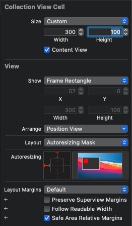
셀의 Size Inspector에서 300 * 100으로 셀의 크기를 변경하고,
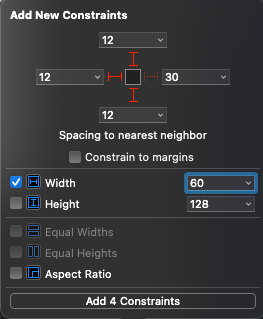
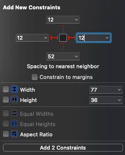
내부에 view를 하나 추가한 뒤 상/하 12, 좌측 12, 너비/높이 60으로 제약을 추가한다.
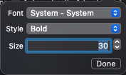
색상 코드를 출력할 Label을 하나 추가한 뒤, 폰트를 Bold에 30pt로 변경한다.
이후 좌/우측에 각각 12의 제약을 추가한다.
그리고 이전에 추가했던 View와 윗면을 기준으로 제약을 추가한다.
Label을 하나 더 추가하고 색상을 Light Gray로 변경한다.
이후 이전에 추가한 Label과는 Leading과 Trailing 제약을 추가하고,
좌측의 View와는 아랫면을 기준으로 제약을 추가한다.
Table View와 마찬가지로 Prototype Cell에 포함된 view들은 코드와 직접 outlet으로 연결할 수 없다.
따라서 새로운 클래스 파일을 생성한 다음 outlet을 연결한다.
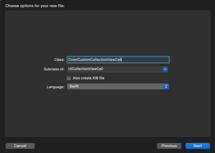
생성하는 클래스 파일은 UICollectionViewCell 클래스를 직/간접적으로 상속받아야 한다.
이후 셀의 커스텀 클래스로 지정한다.
//
//  ColorCustomCollectionViewCell.swift
//  CollectionViewPractice
//
//  Created by Martin.Q on 2021/10/08.
//

import UIKit

class ColorCustomCollectionViewCell: UICollectionViewCell {
	@IBOutlet weak var colorView: UIView!
	@IBOutlet weak var hexLabel: UILabel!
	@IBOutlet weak var nameLabel: UILabel!


}
코드에 view들을 outlet으로 연결한다.
class ColorCustomCollectionViewCell: UICollectionViewCell {
	@IBOutlet weak var colorView: UIView!
	@IBOutlet weak var hexLabel: UILabel!
	@IBOutlet weak var nameLabel: UILabel!

	override func awakeFromNib() {
		super.awakeFromNib()

		colorView.clipsToBounds = true
		colorView.layer.cornerRadius = colorView.bounds.width / 2
	}
}
awakeFromNib을 오버 라이딩하고 colorView의 모서리를 둥글게 만든다.
extension CollectionViewCellViewController: UICollectionViewDataSource {
	func collectionView(_ collectionView: UICollectionView, numberOfItemsInSection section: Int) -> Int {
		return list.count
	}

	func collectionView(_ collectionView: UICollectionView, cellForItemAt indexPath: IndexPath) -> UICollectionViewCell {
		let cell = collectionView.dequeueReusableCell(withReuseIdentifier: "cell", for: indexPath)

		return cell
	}
}
다시 씬의 클래스 파일로 돌아와서 셀을 구성하는 부분을 보면
let cell = collectionView.dequeueReusableCell(withReuseIdentifier: "cell", for: indexPath)dequeReusableCell이 반환하는 형식은 UICollectionViewCell 형식이다.
따로 작성한 outlet을 사용하려면 실제 사용할 형식으로 타입 캐스팅이 필요하다
extension CollectionViewCellViewController: UICollectionViewDataSource {
	func collectionView(_ collectionView: UICollectionView, numberOfItemsInSection section: Int) -> Int {
		return list.count
	}

	func collectionView(_ collectionView: UICollectionView, cellForItemAt indexPath: IndexPath) -> UICollectionViewCell {
		let cell = collectionView.dequeueReusableCell(withReuseIdentifier: "cell", for: indexPath) as! ColorCustomCollectionViewCell

		return cell
	}
}
ColorCustomCollectionViewCell 형식으로 타입캐스팅 한 뒤
extension CollectionViewCellViewController: UICollectionViewDataSource {
	func collectionView(_ collectionView: UICollectionView, numberOfItemsInSection section: Int) -> Int {
		return list.count
	}

	func collectionView(_ collectionView: UICollectionView, cellForItemAt indexPath: IndexPath) -> UICollectionViewCell {
		let cell = collectionView.dequeueReusableCell(withReuseIdentifier: "cell", for: indexPath) as! ColorCustomCollectionViewCell

		let target = list[indexPath.item]
		cell.colorView.backgroundColor = target.color
		cell.hexLabel.text = target.hex
		cell.nameLabel.text = target.title

		return cell
	}
}
view에 적절한 데이터를 저장해 셀을 반환하면 된다.
이 상태로 실행해 보면 이상한 형태로 셀이 출력된다.
이는 실제 Layout의 계산은 cell의 크기인 300 * 100을 기준으로 진행했지만
실제 Collection View에서 출력하는 셀의 크기는 128 * 128이기 때문이다.
따라서 Collection View의 Size Inspector에서 셀의 크기를 300 * 100으로 수정하면
디자인한 대로 표시된다.
코드를 통해 셀에 접근하기
Collection View는 여러 속성을 제공한다.
collectionView.visibleCellsvisibleCells는 Collection View가 표시하고 있는 셀을 배열로 반환한다.
collectionView.cellForItem(at: IndexPath)cellForItem(at:)메소드는 특정 위치에 있는 셀을 반환한다.
셀이 존재하지 않는다면 nil이 반환된다.
collectionView.indexPath(for: UICollectionViewCell)indexPath(for:)메소드는 특정 셀의 위치를 반환한다.
collectionView.indexPathForItem(at: CGPoint)indexPathForItem(at:)메소드는 지정된 좌표에 존재하는 셀의 indexPath를 반환한다.
펜 제스처를 통해 셀의 위치를 바꿀 때 사용한다.
collectionView.indexPathsForVisibleItems
collectionView.indexPathsForSelectedItems
indexPathsForVisibleItems 속성을 통해 셀에 표시되어 있는 셀의 indexPath 배열을 얻고,
indexPathsForSelectedItems 속성을 통해 선택한 셀의 indexPath 배열을 얻을 수 있다.
새 씬을 생성하고, 셀과 씬을 show 방식으로 연결한다.
셀을 선택하면 새로운 씬으로 전환하고, 씬의 배경색을 해당 색으로 설정하도록 구현한다.
또한, 씬의 제목을 색상의 이름으로 설정하도록 한다.
두 씬은 Segue로 연결돼 있고, Segue를 통해 데이터를 전달하려면
화면을 전환하기 전에 전달할 데이터를 정리해야 한다.
class CollectionViewCellViewController: UIViewController {

	@IBOutlet weak var collectionView: UICollectionView!

	let list = MaterialColorDataSource.generateSingleSectionData()

	override func prepare(for segue: UIStoryboardSegue, sender: Any?) {

	}

	override func viewDidLoad() {
		super.viewDidLoad()

		}


}
새롭게 추가한 prepare 메소드는 Segue가 실행되기 전 호출된다.
첫번째 파라미터를 통해 Segue로 연결된 씬에 접근할 수 있다.
두 번째 파라미터에는 Segue를 실행시킨 객체가 전달된다.
지금처럼 셀과 연결된 경우, 터치한 셀이 전달되게 된다.
override func prepare(for segue: UIStoryboardSegue, sender: Any?) {
	guard let cell = sender as? UICollectionViewCell else {
		return
	}
}
두번째 파라미터로 전달된 셀을 UICollectionViewCell로 타입 캐스팅하여 저장한다.
override func prepare(for segue: UIStoryboardSegue, sender: Any?) {
	guard let cell = sender as? UICollectionViewCell else {
		return
	}
	guard let indexPath = collectionView.indexPath(for: cell) else {
		return
	}

	let target = list[indexPath.item]
}
이후 해당 셀을 통해 indexPath와 데이터를 가져온다.
verride func prepare(for segue: UIStoryboardSegue, sender: Any?) {
	guard let cell = sender as? UICollectionViewCell else {
		return
	}
	guard let indexPath = collectionView.indexPath(for: cell) else {
		return
	}

	let target = list[indexPath.item]

	segue.destination.title = target.title
	segue.destination.view.backgroundColor = target.color
}
이후 가져온 데이터를 사용해 새 씬의 데이터를 설정한다.
연습
기존의 UI는 예쁘긴 하지만 빈 공간이 너무 많다.
이전에 사용한 Delegate를 사용해서 세로모드일 때 두 줄로,
가로모드 일 때 세 줄로 표시되도록 변경해 본다.
override func viewDidLoad() {
	super.viewDidLoad()
	if let layout = collectionView.collectionViewLayout as? UICollectionViewFlowLayout {
		layout.itemSize = CGSize(width: 300, height: 100)
		layout.minimumInteritemSpacing = 0
	}
}
셀의 레이아웃 안에 마진이 존재하므로 작은 화면에서도 공간을 활용 할 수 있도록 minimumInteritemSpacing을 0으로 조절한다.
코드에서 설정하지 않고 interface Builder에서 조절해도 상관 없다.
Collection View 의 delegate를 씬으로 연결하고,
extension CollectionViewCellViewController: UICollectionViewDelegateFlowLayout {
	func collectionView(_ collectionView: UICollectionView, layout collectionViewLayout: UICollectionViewLayout, sizeForItemAt indexPath: IndexPath) -> CGSize {

	}
}
extension으로 UICollectionViewDelegateFlowLayout 프로토콜을 채용해 관련 메소드를 작성한다.
collectionView(sizeForItemAt:)메소드는 셀을 출력해야 할 때 마다 호출되는 메소드로,
전달되는 indexPath를 통해 특정 셀에 별도로 적용하거나, 상황에 따라 일괄적으로 적용할 수 있다.
extension CollectionViewCellViewController: UICollectionViewDelegateFlowLayout {
	func collectionView(_ collectionView: UICollectionView, layout collectionViewLayout: UICollectionViewLayout, sizeForItemAt indexPath: IndexPath) -> CGSize {
		guard let layout = collectionViewLayout as? UICollectionViewFlowLayout else {
			return CGSize.zero
		}
		let bound = collectionView.bounds
		var width = bound.width - (layout.sectionInset.left + layout.sectionInset.right)
	}
}
사용 가능한 최대 너비를 계산하기 위해 전달 된 collectionViewLayout을 UICollectionViewFlowLayout으로 타입캐스팅 한다.
collectionView는 현재 화면 전체를 채우고 있고 collectionView를 통해 전체 너비를 알 수 있다.
collectionView의 bounds 속성을 사용한다.
셀을 표현할 수 있는 크기는 화면의 너비에서 Interitem Inset과 Section Inset을 고려해야 하지만,
이전에 minimumInteritemSpacing을 0으로 변경했으므로 Section Inset만 고려하면 된다.
따라서 collectionView의 너비에서 좌우의 sectionInset을 빼면 셀을 표시할 수 있는 최대 너비를 계산 할 수 있다.
extension CollectionViewCellViewController: UICollectionViewDelegateFlowLayout {
	func collectionView(_ collectionView: UICollectionView, layout collectionViewLayout: UICollectionViewLayout, sizeForItemAt indexPath: IndexPath) -> CGSize {
		guard let layout = collectionViewLayout as? UICollectionViewFlowLayout else {
			return CGSize.zero
		}
		let bound = collectionView.bounds
		var width = bound.width - (layout.sectionInset.left + layout.sectionInset.right)

		switch layout.scrollDirection {
		case .vertical :
			if UIApplication.shared.windows.first!.windowScene!.interfaceOrientation.isPortrait {
				width = width / 2
			} else {
				width = width / 3
			}
		default :
			break
		}
		return CGSize(width: width, height: 100)
	}
}
이후 UIApplication.shared.windows.first!.windowScene!.interfaceOrientation.isPortrait 속성으로
현재 앱이 Portrait 모드로 구동중인지 확인한다.
참일 경우 너비를 반으로 나누고, 거짓일 경우 Landscape 모드로 간주, 3등분 한 만큼을 셀의 너비로 사용한다.
이후 셀의 사이즈를 CGSize로 반환하면 원하는 크기의 셀이 출력된다.
다만 이렇게 되면 줄어든 셀의 너비 때문에 Label이 정확히 표시되지 않는 문제가 생긴다.
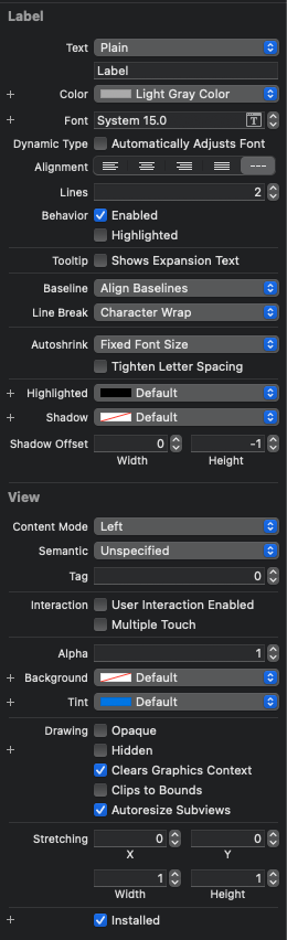
hexLabel은 Autoshrink를 Minimum Font Scale로 변경하고 최솟값을 지정해 준다.
nameLabel Font Size를 15로 변경, Lines를 2로 변경하고, Line Break을 Character Wrap으로 변경한다.

정보를 모두 표시할 수 있게 됐다.
Self Sizing Cell
//
// SelfSizingViewController.swift
// CollectionViewPractice
//
// Created by Martin.Q on 2021/10/08.
//
import UIKit
class SelfSizingViewController: UIViewController {
lazy var list: [String] = {
let lipsum = "Lorem ipsum dolor sit amet, consectetur adipiscing elit, sed do eiusmod tempor incididunt ut labore et dolore magna aliqua. Ut enim ad minim veniam, quis nostrud exercitation ullamco laboris nisi ut aliquip ex ea commodo consequat. Duis aute irure dolor in reprehenderit in voluptate velit esse cillum dolore eu fugiat nulla pariatur. Excepteur sint occaecat cupidatat non proident, sunt in culpa qui officia deserunt mollit anim id est laborum"
return lipsum.split(separator: " ").map { String($0) }
}()
@IBOutlet weak var collectionView: UICollectionView!
override func viewDidLoad() {
super.viewDidLoad()
}
}
extension SelfSizingViewController: UICollectionViewDataSource {
func collectionView(_ collectionView: UICollectionView, numberOfItemsInSection section: Int) -> Int {
return list.count
}
func collectionView(_ collectionView: UICollectionView, cellForItemAt indexPath: IndexPath) -> UICollectionViewCell {
let cell = collectionView.dequeueReusableCell(withReuseIdentifier: "cell", for: indexPath)
if let label = cell.contentView.viewWithTag(100) as? UILabel {
label.text = list[indexPath.item]
}
return cell
}
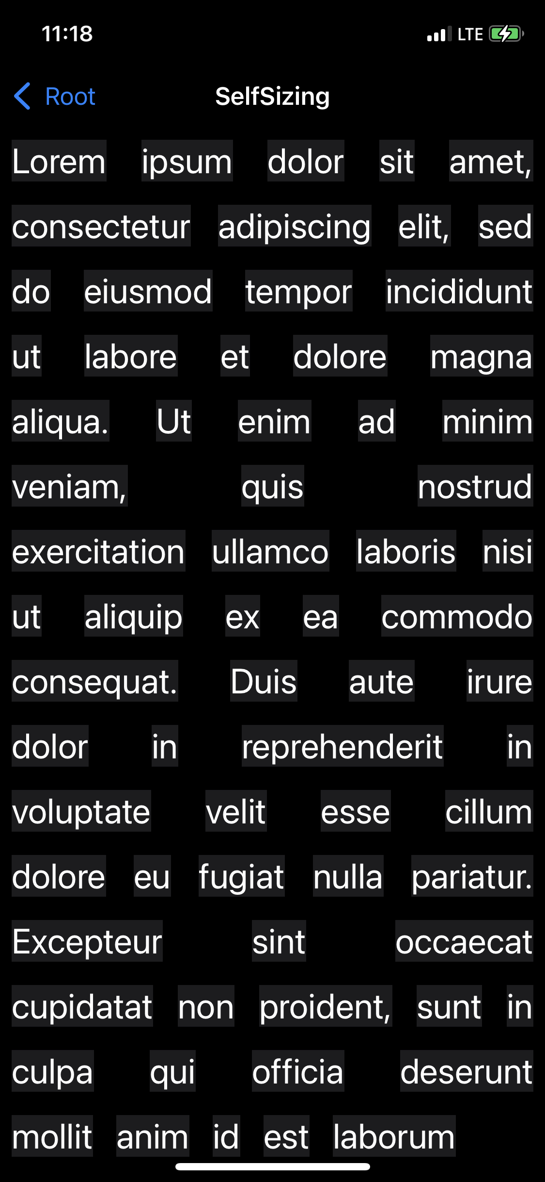
}사용할 셀과 코드는 위와 같다.
Collection View의 Cell Size를 100 * 60으로 설정하고,
셀의 Content Mode는 Center, Tag는 100으로,
Label의 폰트는 24pt이다.
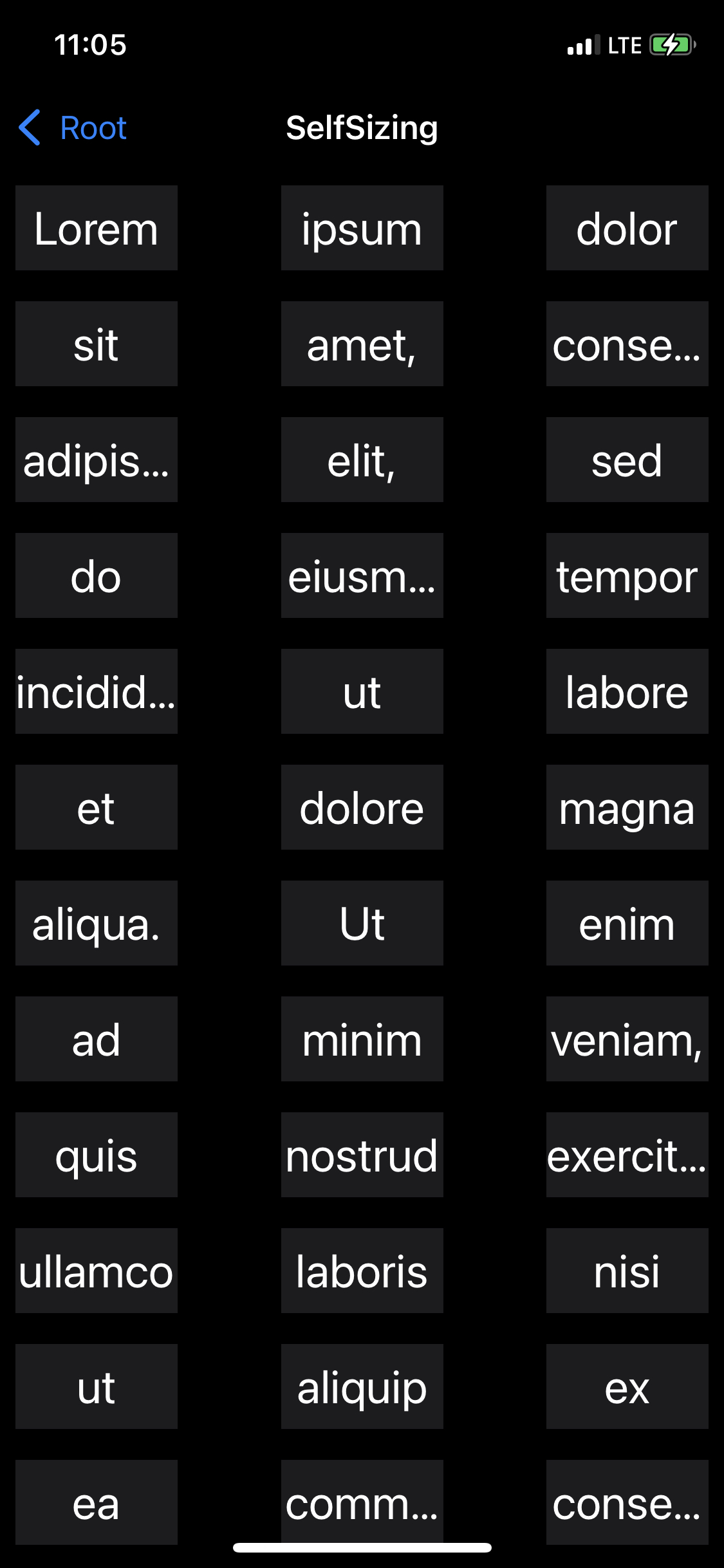
list 배열의 값들을 고정된 크기의 셀에 출력하는 형태로 구현되어있다.
Label에 지정되는 문자열의 길이가 서로 다르기 때문에 위와 같이 축약되는 등의 문제가 생긴다.
문자열의 너비와 높이를 계산해 셀에 적용하는 방법도 있지만 조금 더 간단한 방식으로 이를 해결할 수 있다.
Collection View는 Table View와 마찬가지로 Self Sizing Cell을 지원한다.
Auto Layout을 통해 셀의 크기를 계산하도록 구성하면 Cell의 Content에 따라 크기가 자동으로 조절된다.
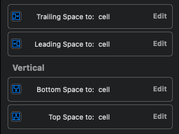
Label의 제약은 기본 margin을 기준으로 Cell 전체를 채우도록 되어있다.
Label은 너비나 높이를 고정된 값으로 지정하지 않으면 Text를 기반해서 자동으로 계산한다.
이러한 과정을 intricit size라고 부른다.
Layout 객체는 위의 제약과 Label의 intricit size를 통해 셀의 크기를 자동으로 계산한다.
이제 필요한 작업은 SelfSizing Cell을 활성화하는 것이다.
override func viewDidLoad() {
	super.viewDidLoad()

	if let layout = collectionView.collectionViewLayout as? UICollectionViewFlowLayout {
		layout.estimatedItemSize = UICollectionViewFlowLayout.automaticSize
	}

}
collectionViewLayout을 UICollectionViewFlowLayout으로 타입 캐스팅해
estimatedItemSize 속성을 UICollectionViewFlowLayout의 automaticSize로 설정한다.
강의에서는 UICollectionViewFlowLayoutAutomaticSize를 사용하지만, 위치가 변경됐다.
Collection View에서 Self Sizing Cell을 구현할 때 중요한 점은
셀의 높이와 너비를 정확히 계산할 수 있도록 정확한 제약을 추가하는 것이다.
Log
2021.10.11.
'Collection View Cell > 연습'에 실습 내용 추가


