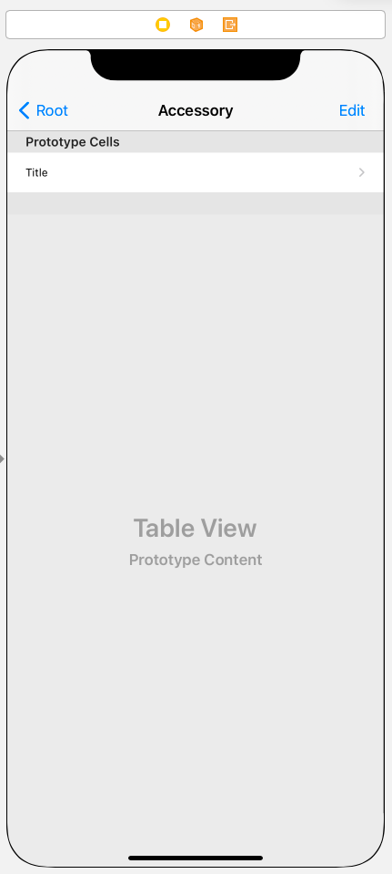
Accessory View
//
//  AccessoryViewController.swift
//  TableViewPractice
//
//  Created by Martin.Q on 2021/09/07.
//

import UIKit

class AccessoryViewController: UIViewController {
    @IBOutlet var accTable: UITableView!

    @IBAction func editAction(_ sender: Any) {
        accTable.setEditing(!accTable.isEditing, animated: true)
    }


    override func viewDidLoad() {
        super.viewDidLoad()
    }

}

extension AccessoryViewController: UITableViewDataSource {
    func tableView(_ tableView: UITableView, numberOfRowsInSection section: Int) -> Int {
        return 5
    }

    func tableView(_ tableView: UITableView, cellForRowAt indexPath: IndexPath) -> UITableViewCell {
        let cell = tableView.dequeueReusableCell(withIdentifier: "dummy", for: indexPath)
        return cell
    }

}
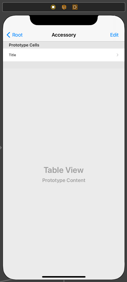
사용할 씬과 연결된 코드는 위와 같다.
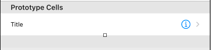
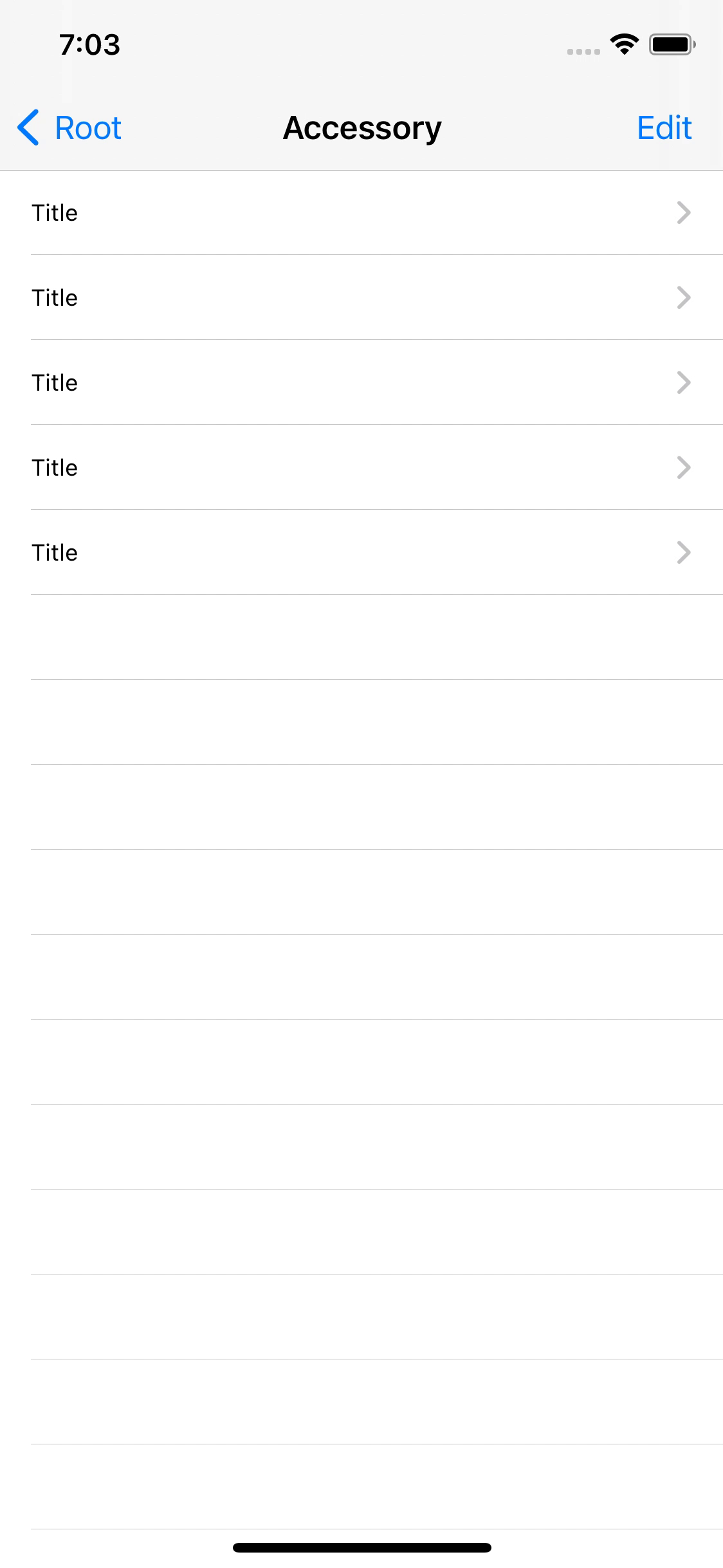
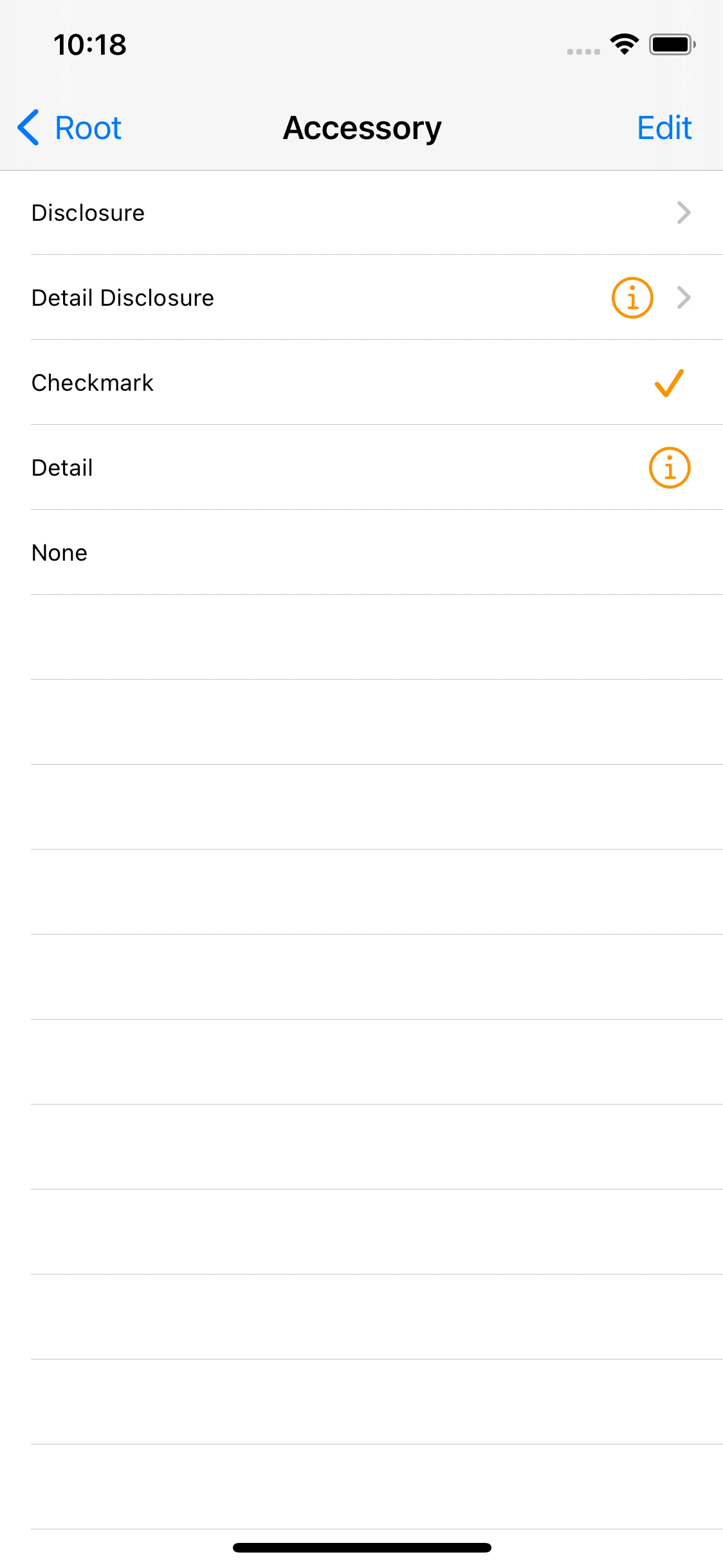
Standard Accessory View
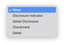
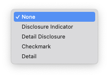
Accessory에서 제공하는 항목은 5가지이다.
- None
셀의 스타일을 제외한 Accessory를 표시하지 않는다.
- Disclosure Indicator
셀의 오른쪽에 꺽쇠를 표시한다.
셀을 선택했을 때 push 스타일로 화면이 전환될 때 주로 사용한다.
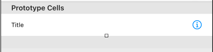
- Detail Disclosure
인포메이션 마크와 꺽쇠를 동시에 표시한다.
Detail 방식과 Disclosure 방식의 혼합형이다.
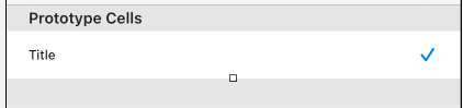
- Checkmark
체크 표시를 표시한다.
선택 상태를 표시할 때 주로 사용한다.
- Detail
인포메이션 마크를 표시한다.
상세정보를 modal 방식으로 표시할 때 주로 사용한다.
표시되는 인포메이션 마크는 독립적인 이벤트를 처리할 수 있는데,
이는 Delegate 메소드로 처리하므로 일반 버튼같이 Action 방식은 불가하다.
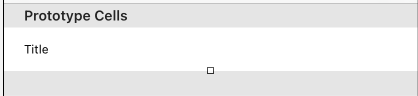
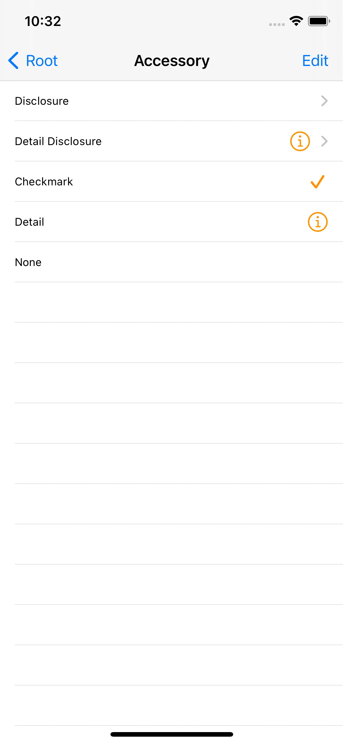
위에서 선택할 수 있는 AccessoryView들은 기본적으로
일반 모드에서만 표시되고, 편집 모드에선 표시되지 않는다.
편집 모드에서도 표시하기 위해선 다음의 옵션을 설정해 줄 필요가 있다.
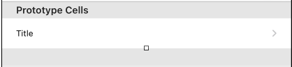
Editing Acc. 옵션으로 위와 같은 항목을 제공하지만 여기서 설정한 AccessoryView는 편집 모드에서 표시된다.
위와 같이 Checkmark가 편집 모드에서 나타나는 것을 확인할 수 있다.
func tableView(_ tableView: UITableView, cellForRowAt indexPath: IndexPath) -> UITableViewCell {
	let cell = tableView.dequeueReusableCell(withIdentifier: "dummy", for: indexPath)

	switch indexPath.row {
	case 0:
		cell.textLabel?.text = "Disclosure"
		cell.accessoryType = .disclosureIndicator
	case 1:
		cell.textLabel?.text = "Detail Disclosure"
		cell.accessoryType = .detailDisclosureButton
	case 2:
		cell.textLabel?.text = "Checkmark"
		cell.accessoryType = .checkmark
	case 3:
		cell.textLabel?.text = "Detail"
		cell.accessoryType = .detailButton
	case 4:
		cell.textLabel?.text = "None"
		cell.accessoryType = .none
        cell.editingAccessoryType = .checkmark
	default:
		break
	}
return cell
}
코드에서는 위와 같이 accessoryType 속성과 editingAccessoryType 속성으로 설정할 수 있다.
위에서 제공하는 Standard Accessory View는 색상을 변경하는 것을 빼면 더 이상 Customizing이 불가능할 정도로 제약이 심하다.
또한, 색상 변경 시에도 AccessoryView에 접근하는 것이 아닌 셀의 tintColor를 변경하는 방식으로 진행한다.
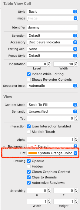

셀의 attribute inspector에서 Tint 색상을 바꾸는 식이다.
하지만 Disclosure indicator는 변경되지 않는다.
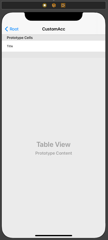
Custom Accessory View
새로운 스타일이 필요하다면 CustomAccessoryView를 사용해야 한다.
//
//  CustomAccViewController.swift
//  TableViewPractice
//
//  Created by Martin.Q on 2021/09/07.
//

import UIKit

class CustomAccViewController: UIViewController {

override func viewDidLoad() {
	super.viewDidLoad()
	}

}

extension CustomAccViewController: UITableViewDataSource {
	func tableView(_ tableView: UITableView, numberOfRowsInSection section: Int) -> Int {
		return 5
	}

	func tableView(_ tableView: UITableView, cellForRowAt indexPath: IndexPath) -> UITableViewCell {
		let cell = tableView.dequeueReusableCell(withIdentifier: "customCell", for: indexPath)
		return cell
	}


}
사용할 씬과 연결된 코드는 위와 같다.
CustomAccessoryView는 interface builder에서는 구현할 수 없다.
따라서 코드에서 구현해야만 하고, tableView(cellForRowAt:) 메소드를 사용하면 오버헤드가 발생하기 때문에,
새로운 클래스를 만들고 초기화 시점에 1회 호출되도록 구현해야 한다.
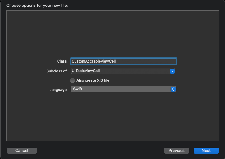
UITableViewCell을 상속받는 새로운 파일을 만들고,
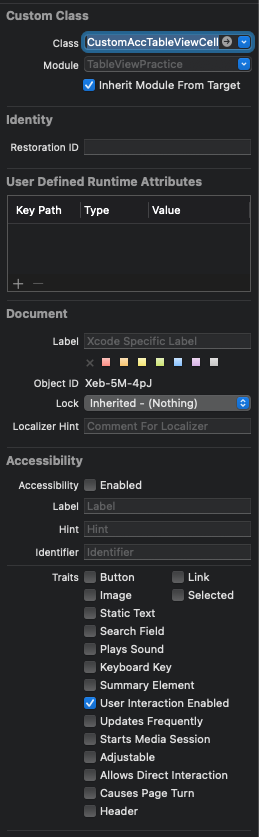
사용할 셀의 CustomClass로 등록한다.
//
//  CustomAccTableViewCell.swift
//  TableViewPractice
//
//  Created by Martin.Q on 2021/09/07.
//

import UIKit

class CustomAccTableViewCell: UITableViewCell {

	override func awakeFromNib() {
		super.awakeFromNib()
		// Initialization code
	}

	override func setSelected(_ selected: Bool, animated: Bool) {
		super.setSelected(selected, animated: animated)

		// Configure the view for the selected state
	}

}
생성된 클래스 파일의 초기 형태는 위와 같다.
//
//  CustomAccTableViewCell.swift
//  TableViewPractice
//
//  Created by Martin.Q on 2021/09/07.
//

import UIKit

class CustomAccTableViewCell: UITableViewCell {

	override func awakeFromNib() {
		super.awakeFromNib()
		let iv = UIImageView(image: UIImage(systemName: "heart"))
		accessoryView = iv
		editingAccessoryView = iv
		// Initialization code
	}

	override func setSelected(_ selected: Bool, animated: Bool) {
		super.setSelected(selected, animated: animated)

		// Configure the view for the selected state
	}

}
초기화 코드는 주로 awakeFromNib 메소드에서 구현한다.
ImageView를 하나 만들고 해당 뷰를 accessoryView로 지정한다.
이렇게 되면 기존 Cell의 Standard Accessory View를 무시하고 이번에 지정한 뷰를 표시하게 된다.
반대로 nil을 저장하면 Standard Accessory View를 표시한다.
Standard Accessory View를 편집 모드와 일반 모드에서 별도로 설정했던 것과 동일하게 설정할 수 있다.
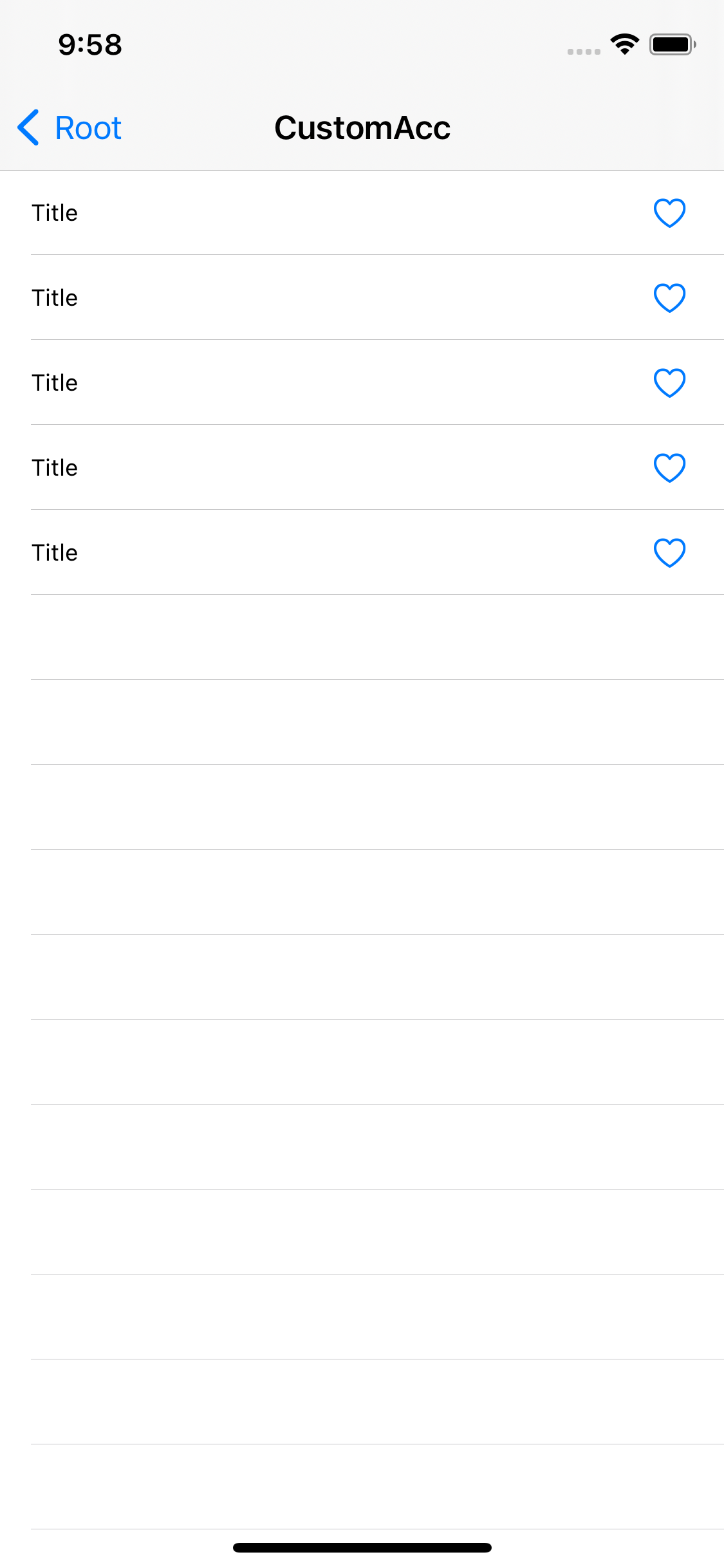
이렇게 지정한 이미지가 AccessoryView로 표시된다.
결과와 같이 위의 방법은 셀의 오른쪽에 Custom Accessory View를 추가할 때 사용한다.
CustomCell보다 훨씬 간단하지만 위치와 크기를 바꿀 수는 없다.
Detail Button Delegate

이전에 언급했듯 Detail 버튼은 터치 시 별도의 이벤트를 처리할 수 있다.
단, Action을 직접 연결할 수 없고 UITableViewDelegate의 메소드를 구현해야 한다.
이전에 사용했던 씬에서 TableView의 delegate를 연결해 준다.
//
//  AccessoryViewController.swift
//  TableViewPractice
//
//  Created by Martin.Q on 2021/09/07.
//

import UIKit

class AccessoryViewController: UIViewController {
	@IBOutlet var accTable: UITableView!

	@IBAction func editAction(_ sender: Any) {
		accTable.setEditing(!accTable.isEditing, animated: true)
	}


	override func viewDidLoad() {
		super.viewDidLoad()
	}

}

extension AccessoryViewController: UITableViewDataSource {
	func tableView(_ tableView: UITableView, numberOfRowsInSection section: Int) -> Int {
		return 5
	}

	func tableView(_ tableView: UITableView, cellForRowAt indexPath: IndexPath) -> UITableViewCell {
		let cell = tableView.dequeueReusableCell(withIdentifier: "dummy", for: indexPath)

		switch indexPath.row {
		case 0:
			cell.textLabel?.text = "Disclosure"
			cell.accessoryType = .disclosureIndicator
		case 1:
			cell.textLabel?.text = "Detail Disclosure"
			cell.accessoryType = .detailDisclosureButton
		case 2:
			cell.textLabel?.text = "Checkmark"
			cell.accessoryType = .checkmark
		case 3:
			cell.textLabel?.text = "Detail"
			cell.accessoryType = .detailButton
		case 4:
			cell.textLabel?.text = "None"
			cell.accessoryType = .none
			cell.editingAccessoryType = .checkmark
		default:
			break
		}
	return cell
	}

}

extension AccessoryViewController: UITableViewDelegate {
	func tableView(_ tableView: UITableView, didSelectRowAt indexPath: IndexPath) {
	}
}
이후 extension으로 UITableViewDelegate 프로토콜을 채용하도록 하고,
tableView(didSelectRowAt:) 메소드를 작성한다.
해당 메소드는 여타 그랬듯 셀을 선택하면 새로운 화면을 push 방식으로 표시한다.
extension AccessoryViewController: UITableViewDelegate {
    func tableView(_ tableView: UITableView, didSelectRowAt indexPath: IndexPath) {

    }

    func tableView(_ tableView: UITableView, accessoryButtonTappedForRowWith indexPath: IndexPath) {

    }
}
새로운 메소드를 하나 더 추가한다.
tableView(accessoryButtonForRowWith:)메소드로 Detail 버튼에 반응하는 메소드이다.
detail 버튼을 선택하면 modal 방식으로 화면을 표시해 본다.
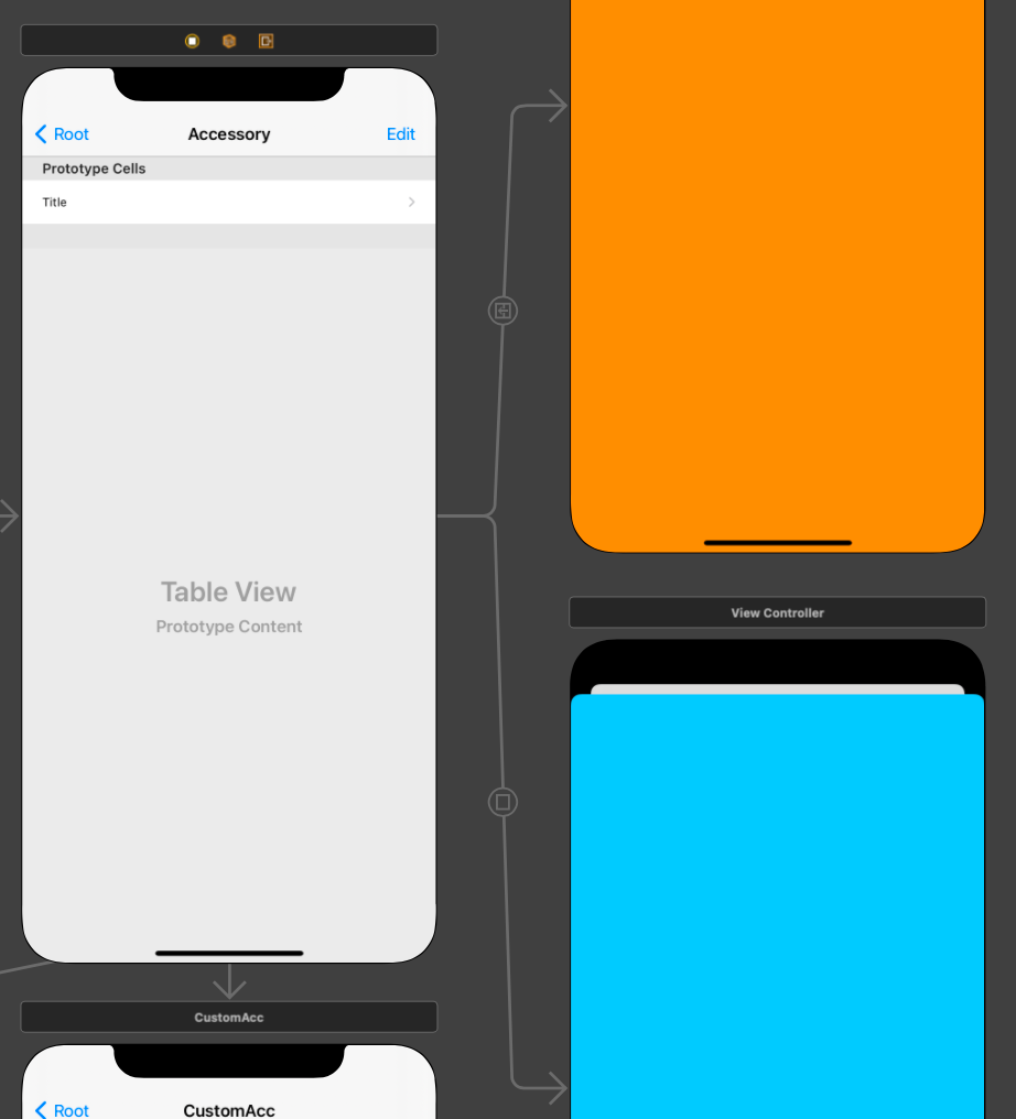
각각 표시할 새로운 씬들을 만들고, 구별할 수 있도록 Background Color를 바꿨다.
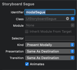
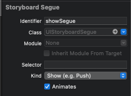
또한, 씬과 씬을 segue로 연결한 다음, Identifier를 지정했다.
extension AccessoryViewController: UITableViewDelegate {
	func tableView(_ tableView: UITableView, didSelectRowAt indexPath: IndexPath) {
		performSegue(withIdentifier: "showSegue", sender: nil)
	}

	func tableView(_ tableView: UITableView, accessoryButtonTappedForRowWith indexPath: IndexPath) {
		performSegue(withIdentifier: "modalSegue", sender: nil)
	}
}
이후 각각의 메소드에서 해당하는 segue를 호출할 수 있도록 코드를 작성한다.
의도한 대로 각각의 segue가 정상적으로 호출된다.
지금대로라면 어떤 셀을 선택해도 새로운 창을 push 방식으로 보여주지만,
Disclosure indicator를 가진 셀을 선택했을 때만 그러하도록 구현하는 것이 좋다.
또한, Detail 버튼을 가지고 있는 셀의 경우 Detail 버튼과 셀의 동작을 같도록 구현하는 것이 좋다.
이번에 사용한 메소드들은 모두 두 번째 파라미터로 indexPath를 전달받도록 되어있다.
따라서 해당 파라미터를 이용해 다음과 같이 수정해 본다.
extension AccessoryViewController: UITableViewDelegate {
	func tableView(_ tableView: UITableView, didSelectRowAt indexPath: IndexPath) {
		switch accTable.cellForRow(at: indexPath)?.accessoryType {
		case .disclosureIndicator:
			performSegue(withIdentifier: "showSegue", sender: nil)
		case .detailButton:
			performSegue(withIdentifier: "modalSegue", sender: nil)
		case .detailDisclosureButton:
			performSegue(withIdentifier: "modalSegue", sender: nil)
		default:
			break
		}
	}

	func tableView(_ tableView: UITableView, accessoryButtonTappedForRowWith indexPath: IndexPath) {
		performSegue(withIdentifier: "modalSegue", sender: nil)
	}
}
조건문을 사용해 선택된 셀의 accessoryType을 비교한 뒤 해당하는 segue를 호출하도록 수정했다.
의도한 대로 동작하게 되었다.
Self Sizing
셀은 셀에 표시하는 내용을 기반으로 높이를 자동으로 계산하는데 이것을 SelfSizing이라고 한다.
Auto Layout을 통해 높이를 자동으로 계산하도록 해 두면 알아서 처리하는 방식이다.
//
// SelfSizingViewController.swift
// TableViewPractice
//
// Created by Martin.Q on 2021/09/07.
//
import UIKit
class SelfSizingViewController: UIViewController {
@IBOutlet weak var tableView: UITableView!
let list = [
("I can swallow a bottle of alcohol and I'll feel like Godzilla Better hit the deck like the card dealer My whole squad's in here, walking around the party A cross between a zombie apocalypse and B-Bobby \"The Brain\" Heenan which is probably the", "eminem"),
("Look! Pockets looking cakey like these bummy bitches make up It's room service bitch, the game requested that it get waked up!", "snow tha product"),
("I'm covering my ears like a kid When your words mean nothing, I go la la la I'm turning up the volume when you speak 'Cause if my heart can't stop it, I'll find a way to block it, I go", "naughty boy")
]
override func viewDidLoad() {
super.viewDidLoad()
}
}
extension SelfSizingViewController: UITableViewDataSource {
func tableView(_ tableView: UITableView, numberOfRowsInSection section: Int) -> Int {
return list.count
}
func tableView(_ tableView: UITableView, cellForRowAt indexPath: IndexPath) -> UITableViewCell {
let cell = tableView.dequeueReusableCell(withIdentifier: "SScell", for: indexPath)
cell.textLabel?.text = list[indexPath.row].0
cell.detailTextLabel?.text = list[indexPath.row].1
return cell
}
}
extension SelfSizingViewController: UITableViewDelegate {
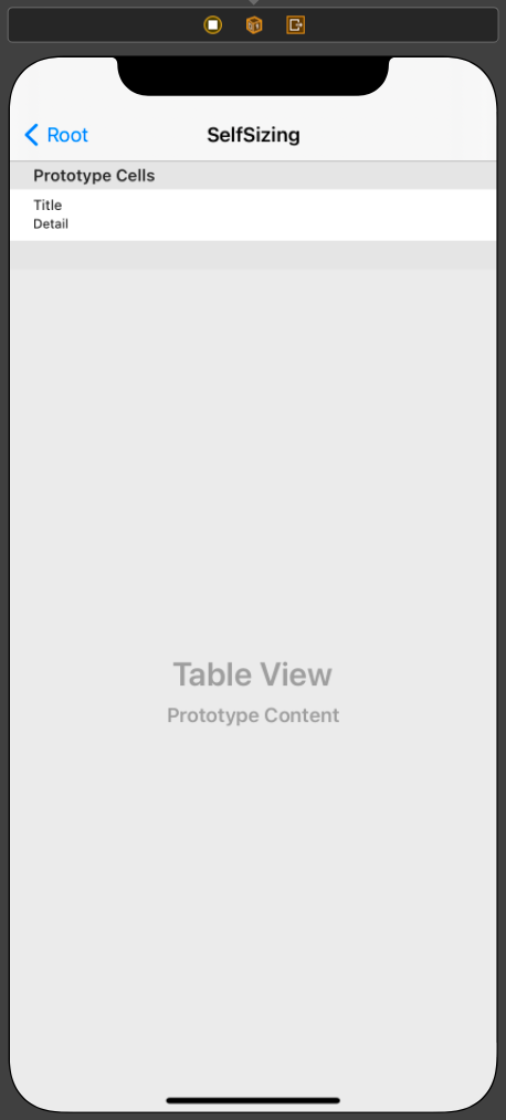
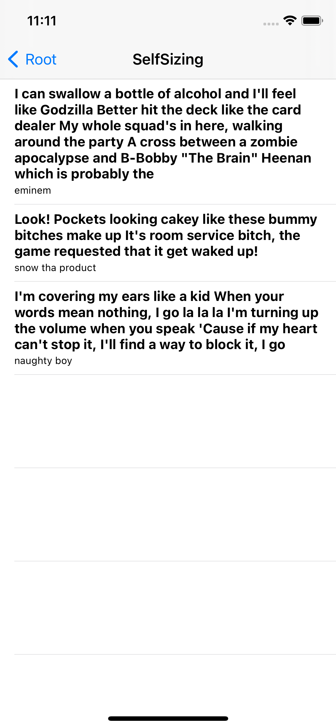
}사용할 씬과 연결된 코드는 위와 같다.
셀은 Subtitle 스타일로 선택했다.
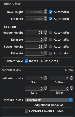
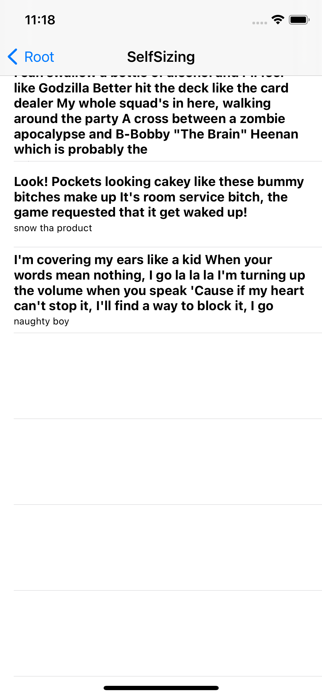
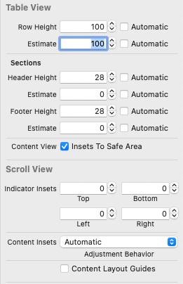
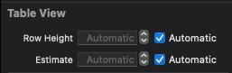
TableView의 size inspector를 확인해 보면 Row Height와 Estimate가 전부 Automatic으로 설정되어있다.
지금의 상태는 SelfSizing이 작동하는 상태이다.
iOS 11부터 SelfSizing이 활성화되어 있는 게 기본이지만,
이전 버전으로 빌드하거나 코드로 TableView를 작성한 경우엔 별도로 설정해야 할 필요가 있다.
override func viewDidLoad() {
	super.viewDidLoad()
	tableView.rowHeight = UITableView.automaticDimension
	tableView.estimatedRowHeight = UITableView.automaticDimension
}
코드로는 위와 같이 rowHeight 속성과 estimatedRowHeight 속성을
UItableView의 automaticDimension으로 설정하면 된다.
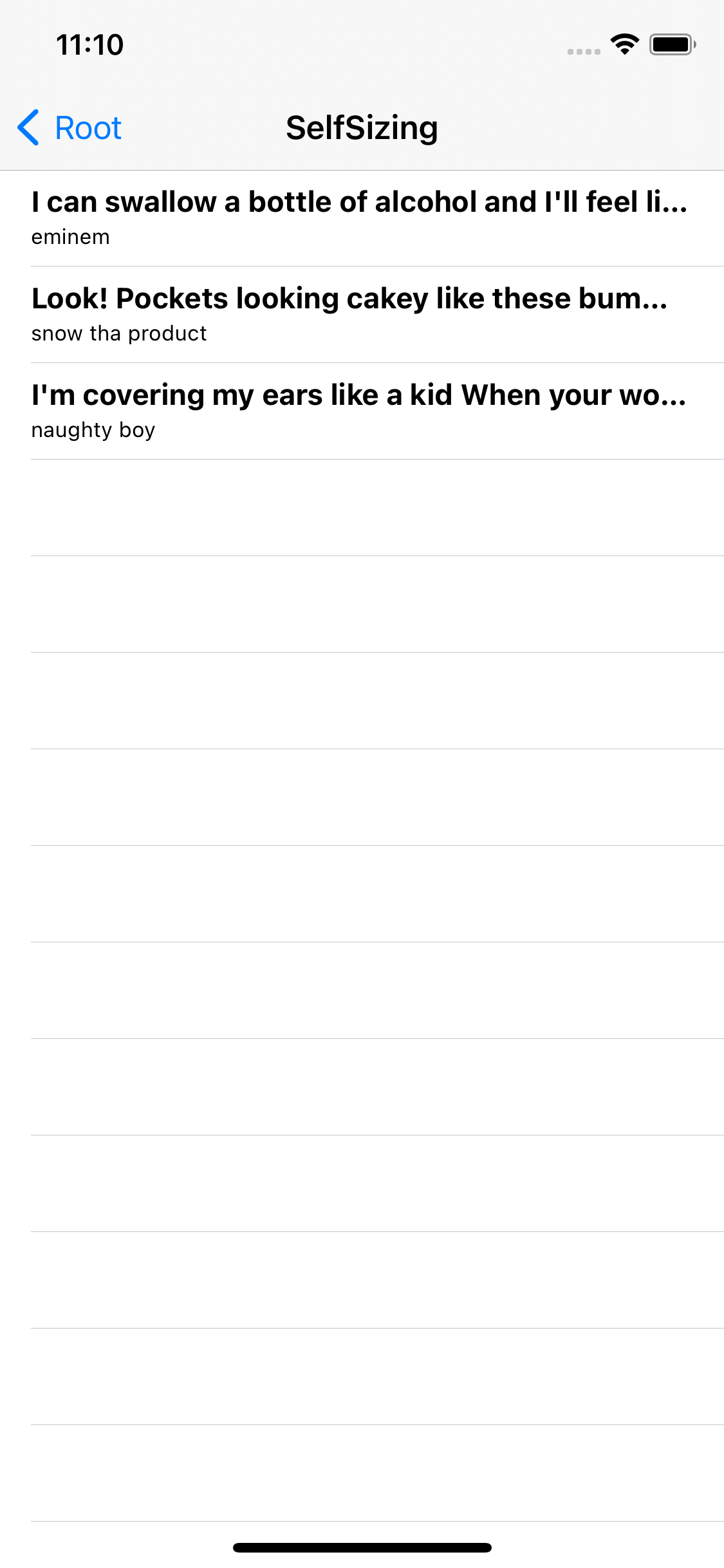
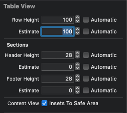
하지만 실행해 보면 만족스럽지 못한 결과를 볼 수 있다.
지금 상태는 Label이 표현 범위를 넘어가는 텍스트를 생략해 보여주고 있기 때문으로 설정을 바꿔주면 해결할 수 있다.
따라서 레이블의 표시 줄 수를 무제한으로 설정하고,
LineBreak를 설정해 주면
Cell의 내용에 따라 높이가 자동으로 변해 표시된다.
TableView는 셀의 높이 계산에 AutoLayout 제약과 뷰의 속성을 사용하기 때문에
올바른 제약과 속성을 추가하는 것이 중요하다.
지금과 같이 기본 스타일을 사용하면 자동으로 추가되기 때문에 문제가 없지만,
CustomCell을 사용할 때는 높이를 정확히 계산할 수 있도록 제약을 추가하는 것이 대단히 중요하다.
표시되는 내용의 높이를 예측할 수 없다면 지금처럼 SelfSizing을 사용해야 한다.
하지만 동일하게 표시된다면 해당 설정을 끄고 고정된 값을 사용하는 것이 좋다.
테이블의 높이를 계산하는 프로세스를 단축시킬 수 있어 스크롤 성능이 향상된다.
override func viewDidLoad() {
super.viewDidLoad()
tableView.rowHeight = 100
tableView.estimatedRowHeight = 100
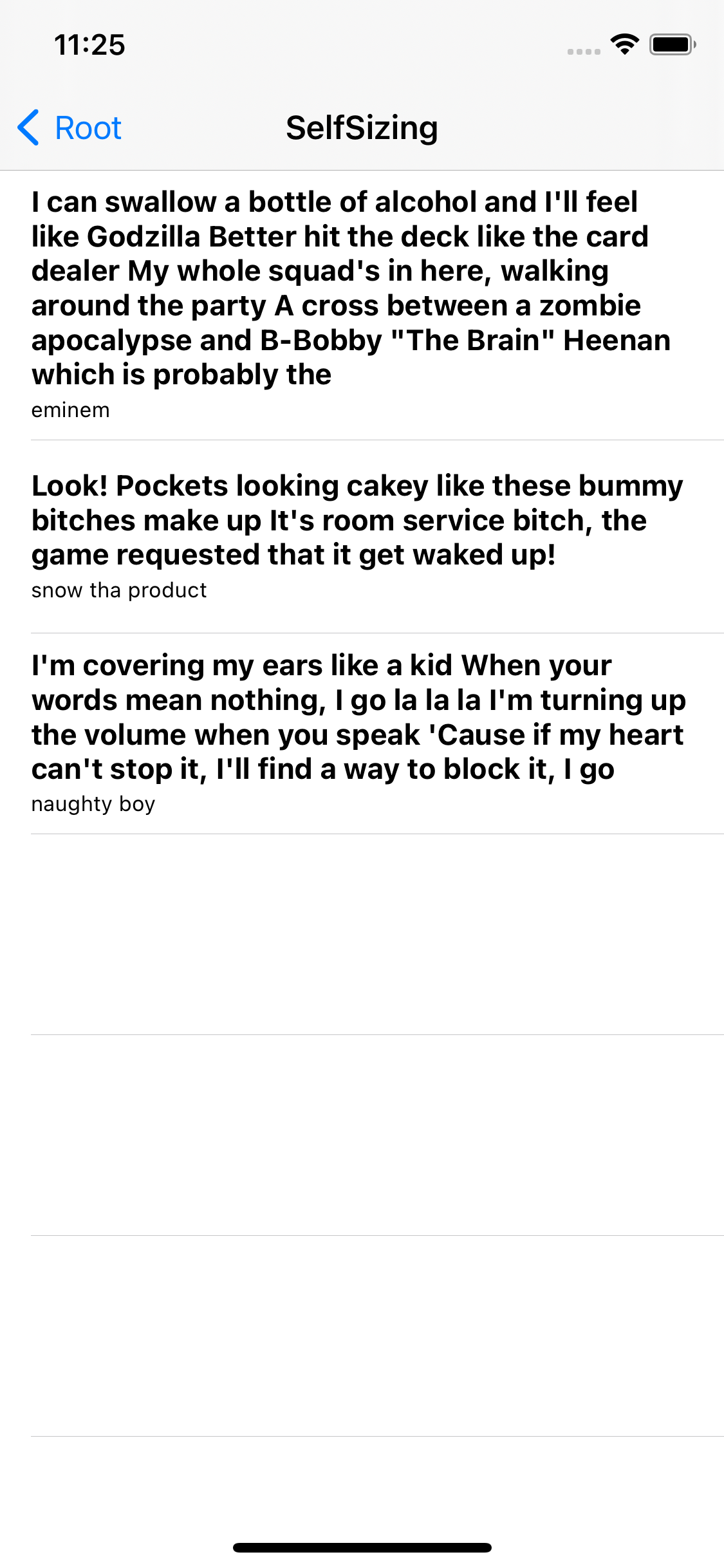
}이번엔 셀의 높이를 100으로 고정했다.
모든 셀의 높이가 100으로 고정된 것을 확인할 수 있다.
이번에는 특정 셀의 높이만 고정해 본다.
extension SelfSizingViewController: UITableViewDelegate {
	func tableView(_ tableView: UITableView, heightForRowAt indexPath: IndexPath) -> CGFloat {
		if indexPath.row == 1 {
			return 100
		} else {
			return UITableView.automaticDimension
		}
	}
	func tableView(_ tableView: UITableView, estimatedHeightForRowAt indexPath: IndexPath) -> CGFloat {
		if indexPath.row == 1 {
			return 100
		} else {
			return UITableView.automaticDimension
		}
	}
}
UITableViewDelegate 프로토콜의
tableView(heightForRowAt:)와 tableView(estimateHeightForRowAt:) 메소드를 사용해 구현한다.
indexPath를 활용해 특정 셀을 지정하고 셀의 높이를 반환하면 된다.
해당 메소드들의 우선순위가 interface builder 보다 높기 때문에 중복돼 설정되어 있다면 코드의 설정이 우선 적용된다.
또한 둘을 함께 사용할 때에 TableView의 스크롤 성능 개선을 조금 더 기대할 수 있다.
지정한 두 번째 셀의 높이가 100이고 나머지 셀들은 자동으로 높이를 계산한다.
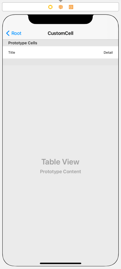
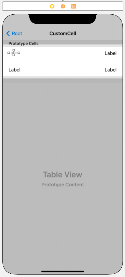
Custom Cell

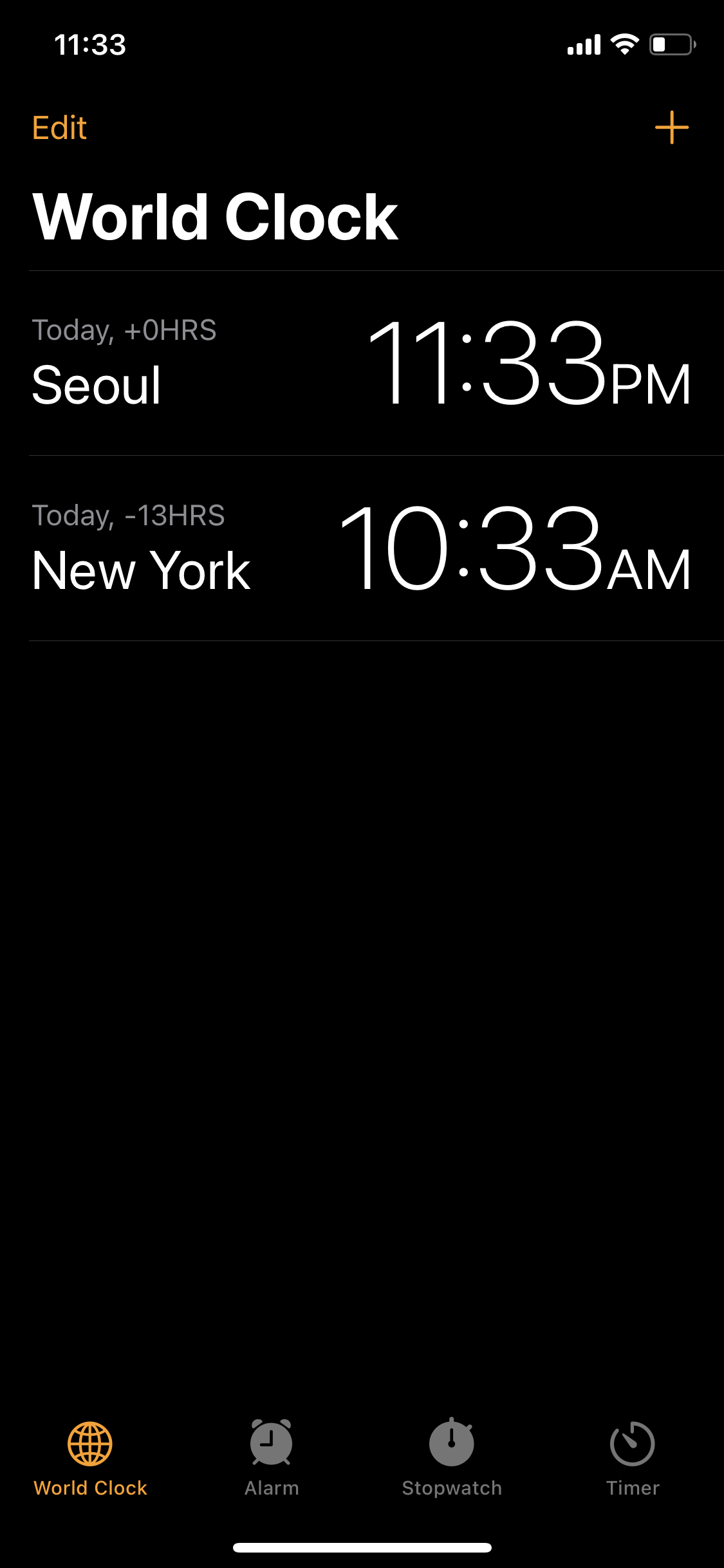
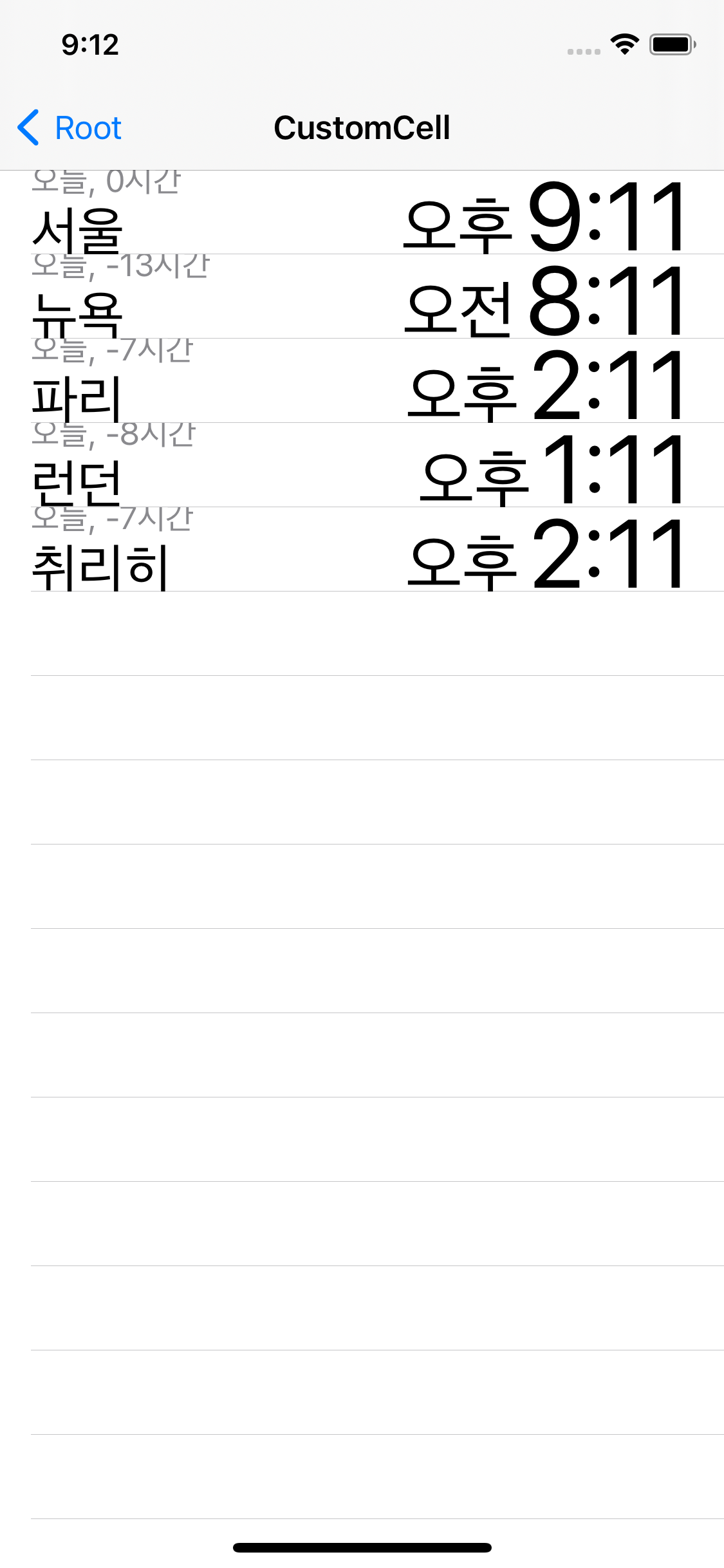
아이폰의 시계 앱의 세계시간 탭이 대표적인 CustomCell의 예이다.
CustomCell은 기본 스타일 대비 자유롭게 UI를 구성할 수 있다는 장점이 있지만,
그런 만큼 제약 추가와 outlet 연결의 번거로움이 따른다.
여기에 Self Sizing까지 사용해야 한다면 높이를 계산할 수 있는 제약까지 고려해야 한다.
//
//  CustomCellViewController.swift
//  TableViewPractice
//
//  Created by Martin.Q on 2021/09/07.
//

import UIKit

class CustomCellViewController: UIViewController {

	let list = WorldTime.generateData()

	override func viewDidLoad() {
		super.viewDidLoad()
	}

}

extension CustomCellViewController: UITableViewDataSource {
	func tableView(_ tableView: UITableView, numberOfRowsInSection section: Int) -> Int {
		return list.count
	}

	func tableView(_ tableView: UITableView, cellForRowAt indexPath: IndexPath) -> UITableViewCell {
		let cell = tableView.dequeueReusableCell(withIdentifier: "customCell", for: indexPath)
		cell.textLabel?.text = list[indexPath.row].location
		cell.detailTextLabel?.text = "\(list[indexPath.row].date) \(list[indexPath.row].time)"
		return cell
	}


}
사용할 씬과 연결된 코드는 위와 같다.
//
//  WorldTime.swift
//  TableViewPractice
//
//  Created by Martin.Q on 2021/09/08.
//

import Foundation

struct WorldTime {
	let date: String
	let hoursGMT: Int
	let location: String
	let ampm: String
	let time: String

	static func generateData() -> [WorldTime] {
		let list = [("Asia/Seoul","서울"), ("America/New_York", "뉴욕"), ("Europe/Paris","파리"), ("Europe/London", "런던"), ("Europe/Zurich","취리히")]
		let now = Date()
		let formatter = DateFormatter()
		formatter.locale = Locale(identifier: "ko_kr")
		formatter.doesRelativeDateFormatting = true

		var result = [WorldTime]()

		for (timeZone, location) in list {
			guard let tz = TimeZone(identifier: timeZone) else { continue }

			let dt = now.addingTimeInterval(TimeInterval(tz.secondsFromGMT() - (9 * 3600)))

			formatter.dateStyle = .short
			formatter.timeStyle = .none
			let date = formatter.string(from: dt)

			formatter.dateFormat = "a"
			let amapm = formatter.string(from: dt)

			formatter.dateFormat = "h:mm"
			let time = formatter.string(from: dt)
			let hoursGMT = (tz.secondsFromGMT() / 3600) - 9

			let data = WorldTime(date: date, hoursGMT: hoursGMT, location: location, ampm: amapm, time: time)
				result.append(data)
		}
		return result
	}
}
list에 저장되는 WorldTime의 코드는 위와 같다.
배열에 저장된 시간대와 지역과 formatter를 사용해 date, hoursGMT, location, ampm 그리고 time을 합쳐,
WorldTime 배열로 반환한다.
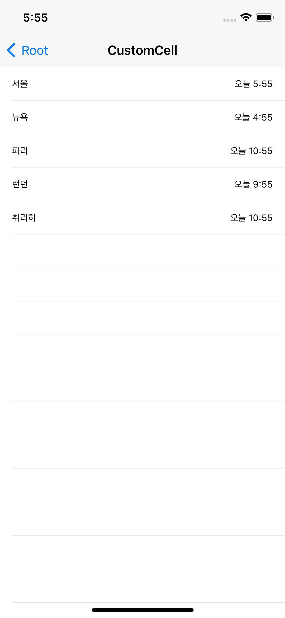
현재의 화면은 위와 같다.
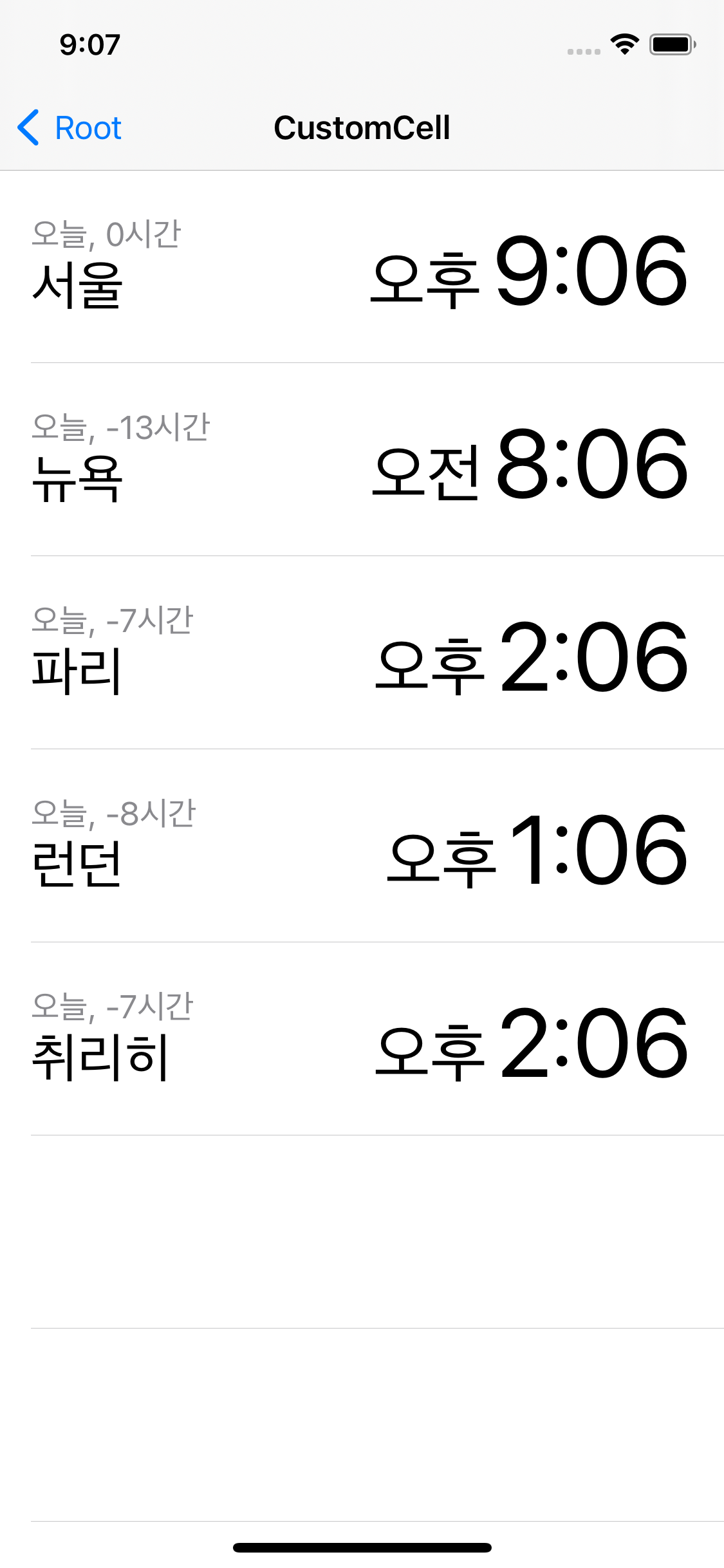
별도의 정보를 표시할 공간이 없으므로 다른 데이터들은 무시된 채, 지정된 지명과 시간만 표시되고 있다.
존재하는 정보들을 모두 표시하기 위해 4개의 Label과 StackView로 표현해 보도록 한다.
셀 디자인하기
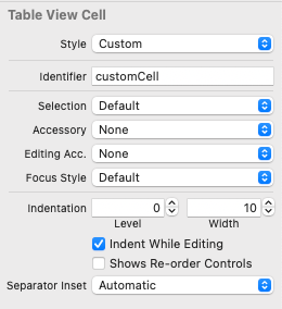
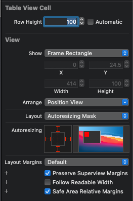
셀의 스타일을 Custom으로 변경하고,
Table에서 셀의 높이를 100으로 변경한다.
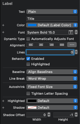
첫 번째 Label의 Color를 Secondary Label Color로,
Font는 Body로, Dynamic Type 옵션은 활성화한다.

두 번째 Label의 Color는 Default로, Font는 Title 1, Dynamic Type 옵션을 활성화한다.
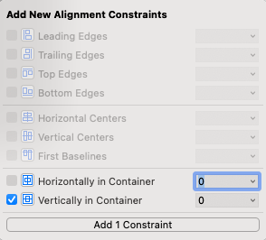
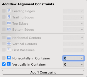
두 개의 Label을 StackView로 묶고, leading 제약을 0으로, 정렬 제약을 수직 중앙으로 설정하고,
StackView의 attribute inspector에서 sapcing을 0으로 설정해 뷰 사이의 간격을 없애준다.
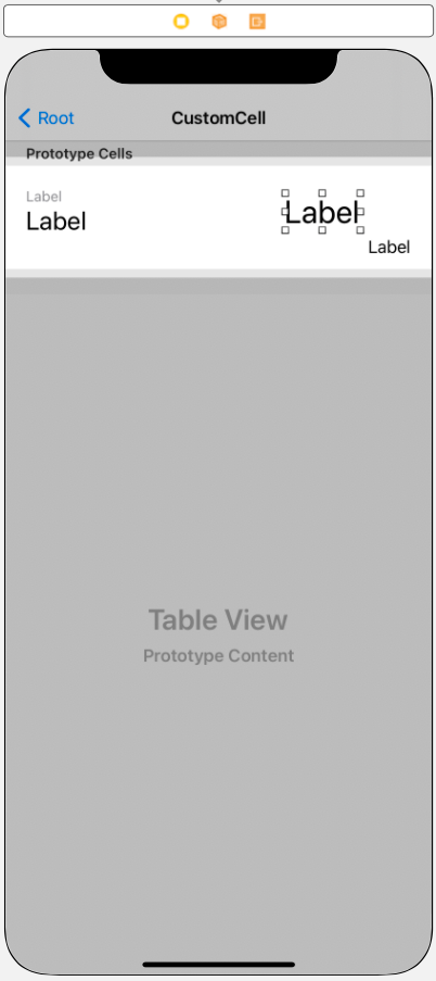
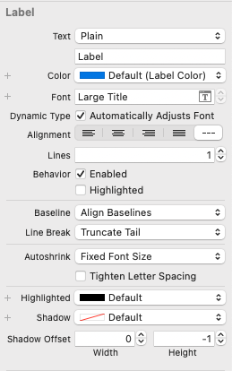
세 번째 Label의 Color는 Default, Font는 Large Title, Dynamic Type 옵션을 활성화한다.
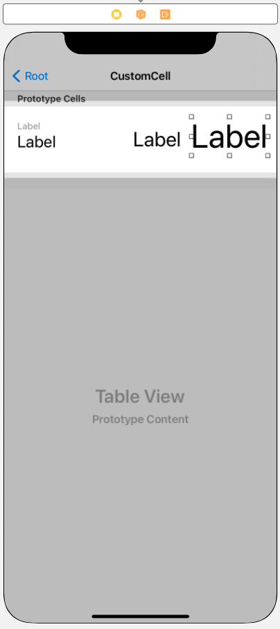

네 번째 Label의 Color는 Default, Font는 50으로 고정한다. Dynamic Type 옵션은 활성화하지 않는다.
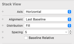
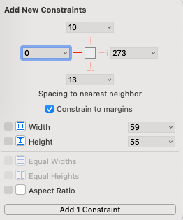
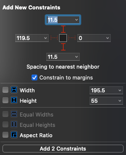
세 번째, 네 번째 Label을 스택으로 묶고, 정렬을 Last BaseLine으로, 뷰 사이의 간격을 5로 설정한다.
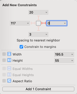
trailing 제약을 0으로 설정하고, 정렬 제약도 수직 중앙으로 설정한다.
또한 왼쪽의 스택과 겹치지 않도록 leading 제약을 10으로 설정 한 뒤,
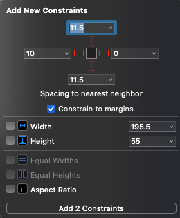
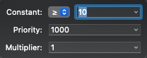
size inspector에서 Constant를 Greater then으로 변경하면 셀 디자인은 완료된다.
데이터 연결하기
완성된 셀에 코드를 통해 데이터를 표시하기만 하면 완료된다.
커스텀 셀에 데이터를 연결하기 위해서는 outlet으로 연결하거나 viewTagging을 활용할 수 있다.
view tagging 방식
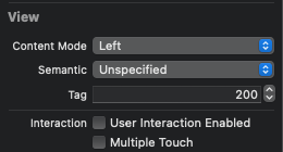
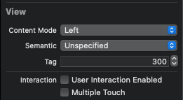
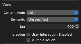
앞에서 추가한 4개의 Label의 tag를 100, 200, 300, 400으로 지정한다.
func tableView(_ tableView: UITableView, cellForRowAt indexPath: IndexPath) -> UITableViewCell {
	let cell = tableView.dequeueReusableCell(withIdentifier: "customCell", for: indexPath)
	if let dateLabel = cell.viewWithTag(100) as? UILabel {
		dateLabel.text = "\(list[indexPath.row].date), \(list[indexPath.row].hoursGMT)시간"
	}
	if let locationLabel = cell.viewWithTag(200) as? UILabel {
		locationLabel.text = list[indexPath.row].location
	}
	if let ampmLabel = cell.viewWithTag(300) as? UILabel {
		ampmLabel.text = list[indexPath.row].ampm
	}
	if let timeLabel = cell.viewWithTag(400) as? UILabel {
		timeLabel.text = list[indexPath.row].time
	}
	return cell
}
이제 viewWithTag 메소드를 사용해 태그를 통해 해당 Lable에 접근하면 된다.
viewWithTag 메소드는 결과를 반환할 때 UIView의 형식으로 반환하게 되므로, 위처럼 UILabel로 typecasting 해야 한다.
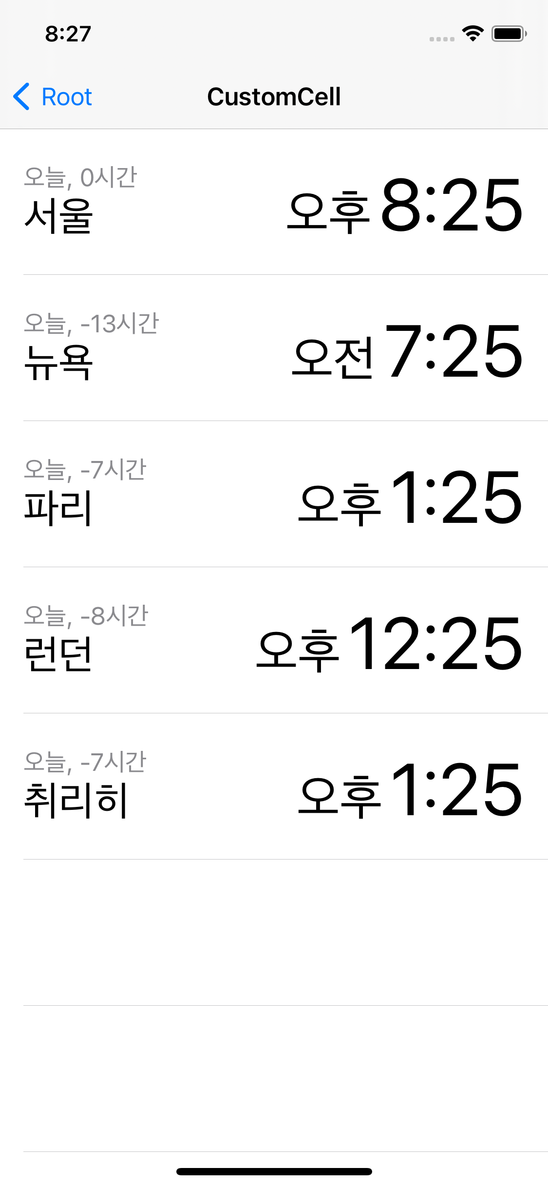
기존의 샘플과 상당히 유사한 UI를 표시하고 있다.
view tagging 방식은 태그를 직접 설정해야 하고, type casting이 필요하다는 단점을 가지고 있다.
따라서 셀에 포함된 뷰의 수가 늘어날수록 코드도 복잡해진다.
outlet 연결 방식
셀에 포함된 뷰를 outlet으로 연결할 때는 연결 대상이 매우 중요하다.
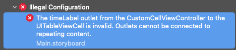
일반적인 방법으로 Label을 outlet으로 연결하면 에러가 발생하는데,
'반복되는 콘텐츠와 연결할 수 없다.'
가 그 내용이다.
지금 연결한 Label은 prototypeCell에 포함되어있고,
prototypeCell은 tableView 내에서 셀을 생성하는 탬플릿으로 반복 사용된다.
따라서 몇 번째 셀에 존재하는 Label인지 코드에서 알 턱이 없다.
이러한 경우 CustomCell 클래스를 만들고 연결해야 한다.
//
//  TimeTableViewCell.swift
//  TableViewPractice
//
//  Created by Martin.Q on 2021/09/08.
//

import UIKit

class TimeTableViewCell: UITableViewCell {

	override func awakeFromNib() {
		super.awakeFromNib()
		// Initialization code
	}

	override func setSelected(_ selected: Bool, animated: Bool) {
		super.setSelected(selected, animated: animated)

		// Configure the view for the selected state
	}

}
UITableViewCell을 상속받는 새 파일을 생성하고
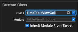
셀의 Custom Class로 지정한다.
//
//  TimeTableViewCell.swift
//  TableViewPractice
//
//  Created by Martin.Q on 2021/09/08.
//

import UIKit

class TimeTableViewCell: UITableViewCell {

	@IBOutlet weak var dateLabel: UILabel!
	@IBOutlet weak var locationLabel: UILabel!
	@IBOutlet weak var ampmLabel: UILabel!
	@IBOutlet weak var timeLabel: UILabel!


	override func awakeFromNib() {
		super.awakeFromNib()
		// Initialization code
	}

	override func setSelected(_ selected: Bool, animated: Bool) {
		super.setSelected(selected, animated: animated)

		// Configure the view for the selected state
	}

}
이후 해당 파일에 Label을 모두 연결한다.
func tableView(_ tableView: UITableView, cellForRowAt indexPath: IndexPath) -> UITableViewCell {
 	let cell = tableView.dequeueReusableCell(withIdentifier: "customCell", for: indexPath)

	return cell
}
이젠 tableView가 연결된 코드에서 Label을 바꿔줘야 한다.
tableView에서 생성하는 dequeReusableCell은 실제로는 우리가 새로 생성한 TimeTableViewCell 클래스이지만,
생성하는 과정에서 UITableViewCell 클래스로 업 캐스팅된다.
하지만 UITableViewCell에는 우리가 연결한 Label들이 존재하지 않기 때문에 다운 캐스팅해 줄 필요가 있다.
func tableView(_ tableView: UITableView, cellForRowAt indexPath: IndexPath) -> UITableViewCell {
 	let cell = tableView.dequeueReusableCell(withIdentifier: "customCell", for: indexPath) as! TimeTableViewCell

	return cell
}
위와 같이 다운 캐스팅 한 이후엔 정상적으로 Label에 접근할 수 있다.
func tableView(_ tableView: UITableView, cellForRowAt indexPath: IndexPath) -> UITableViewCell {
	let cell = tableView.dequeueReusableCell(withIdentifier: "customCell", for: indexPath) as! TimeTableViewCell

	cell.dateLabel.text = "\(list[indexPath.row].date), \(list[indexPath.row].hoursGMT)시간"
	cell.locationLabel.text = list[indexPath.row].location
	cell.ampmLabel.text = list[indexPath.row].ampm
	cell.timeLabel.text = list[indexPath.row].time
	return cell
}
코드는 훨씬 단순해졌지만 결과는 동일하다.
view tagging 방식과 비교했을 때 클래스를 새로 만들어야 하고, outlet도 직접 연결해야 하는 등 작업의 양이 많아
당장은 불리해 보이지만 Cell이 복잡해질수록 outlet 방식이 더 유리해진다.
이번엔 tableView의 selfSizing을 활성화하고 실행해 보자.
셀 안의 뷰들이 모두 잘린 것을 확인할 수 있고

콘솔에서도 셀의 높이를 정확히 판단할 수 없어 기본 높이로 출력했다는 메시지를 띄우고 있다.
따라서 selfSizing에서 말했던 대로 높이를 정확히 계산할 수 있도록 제약을 추가해 줘야 한다.
셀의 높이를 설정하면 prototypeCell을 구성하는 높이로 사용되고,
runtime에서는 다른 값들보다 우선순위가 낮다.
selfsizing이 활성화되어있다면 자동으로 계산되고, tableView의 값이나 delegate에서 반환하는 값으로 설정된다.
UI를 작성할 때 제약으로 수직선상 중앙에 제약을 추가했지만 위와 아래의 여백은 제약으로 추가하지 않았다.
따라서 높이가 100으로 고정되어 있다면 상관없으나 기준이 사라진다면 이야기가 달라진다.
이번엔 오른쪽의 스택을 선택하고 위와 아래에 제약을 추가한다.
이렇게 되면 Label의 폰트에 따라 자동으로 높이를 계산하고, 여백의 크기를 더해 최종 높이를 계산할 수 있다.

이제는 오류도 사라지고, 이전처럼 UI를 전부 표시할 수 있게 됐다.
하나의 커스텀 셀을 재사용하기
단순히 셀을 복사해서 붙여 넣기 하면 셀을 사용할 수는 있겠지만,
편집이 필요한 경우 복사한 만큼 수정해야 한다.
하나의 씬에서 사용할 커스텀 셀이라면 prototype cell에 추가하는 것이 가장 쉽고 단순하지만,
여러 씬에서 반복적으로 사용해야 한다면 별도의 파일로 prototype cell을 만들고 코드를 통해 tableview에 등록한다.
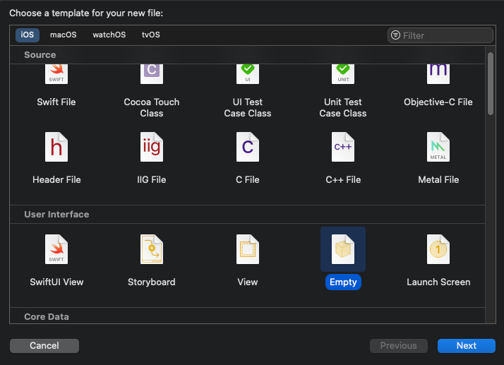
template에서 empty를 선택해 새 파일을 생성한다.
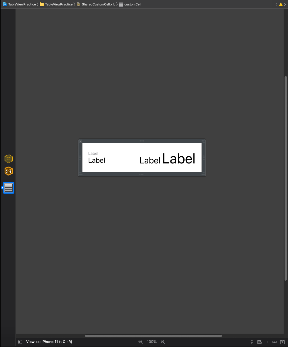
그리고 tableView에서 사용했던 CustomCell을 복사해 붙여 넣기 한다.
복사 붙여 넣기가 아닌 라이브러리에서 처음부터 직접 작성도 가능하다.
class CustomCellViewController: UIViewController {

	@IBOutlet weak var timeTableView: UITableView!
	let list = WorldTime.generateData()


	override func viewDidLoad() {
		super.viewDidLoad()

	}

}
tableView를 코드에 outlet으로 연결하고,
tableView에 cell을 등록해야 한다.
새로운 UInib 인스턴스를 생성하고, 재사용 식별자와 함께 등록하는 방식이다.
이러한 과정은 특별한 이유가 없다면 viewDidLoad에 구현하게 된다.
override func viewDidLoad() {
	super.viewDidLoad()

	let cellNib = UINib(nibName: <#T##String#>, bundle: <#T##Bundle?#>)

}
먼저 새로운 UINib 인스턴스를 생성한다.
첫 번째 파라미터로는 방금 만든 xib 파일의 이름을 전달하고,
두 번째 파라미터로는 인터페이스 파일이 저장되어 있는 번들을 전달하는데 지금처럼 동일한 번들이라면 nil을 전달한다.
override func viewDidLoad() {
	super.viewDidLoad()

	let cellNib = UINib(nibName: "SharedCustomCell", bundle: nil)
	timeTableView.register(cellNib, forCellReuseIdentifier: "SharedCustomCell")
}
tableView에 등록할 때는 register 메소드를 사용한다.
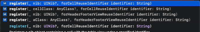
reusableCell을 등록하는 register 메소드는 두 가지로, 셀과 nib을 사용하는 차이가 있다.
여기선 nib을 사용했다.
첫 번째 파라미터에는 앞서 생성한 nib 인스턴스를, 두 번째에는 identifier를 전달한다.
func tableView(_ tableView: UITableView, cellForRowAt indexPath: IndexPath) -> UITableViewCell {
	let cell = tableView.dequeueReusableCell(withIdentifier: "SharedCustomCell", for: indexPath) as! TimeTableViewCell

	cell.dateLabel.text = "\(list[indexPath.row].date), \(list[indexPath.row].hoursGMT)시간"
	cell.locationLabel.text = list[indexPath.row].location
	cell.ampmLabel.text = list[indexPath.row].ampm
	cell.timeLabel.text = list[indexPath.row].time
	return cell
}
그리고 재사용 셀을 생성할 때 identifier로 register의 두 번째 파라미터로 전달했던 identifier를 사용하면 된다.

하지만 씬에 진입하면 충돌이 발생하고, 콘솔에는
'nib파일의 식별자와 등록할 때 사용한 재사용 셀의 식별자가 다르다.'
라는 내용의 에러가 표시된다.


이는 기존의 셀을 복사해서 사용한 탓에 identifier가 다르게 입력돼 있는 것 때문으로,
일반적으로 nib파일에서 셀을 작성할 때는 identifier를 작성할 필요가 없다.
이는 셀을 table에 등록하는 과정에서 identifier를 함께 정하기 때문으로,
오른쪽과 같이 identifier를 비워주거나 동일하게 수정해 주면 문제없이 실행된다.
이렇게 nib파일을 사용해 재사용하게 되면,
해당 파일 하나만 수정하면 되기 때문에 복사해 사용했을 때 보다 유지보수면에서 유리하다.


